Monday, 29 January 2018

Project 459: A London thank you


A colleague just bought a house and had to ask a massive favour of another colleague in order to make it work. She wanted a thank you that was deeply personal and after talking to her about it we decided a watercolour London scene was exactly the right note.

I started by heat embossing the Tim Holtz stamp from Claire on watercolour paper. Then I used Distress Inks and a water brush to get a grey and blue sky effect. I added a Mama Elephant thank you set in the corner that would offset the skyline and hold its own.

I decided to triple mount it for a touch more elegance. Really happy with it and my colleague loves it too. A lovely little art project.

Tuesday, 23 January 2018

Project 458: A tic tac toe Bugaboo challenge


This weekend I was having so much fun with challenges I knew I had to play along with the Bugaboo Tic Tac Toe challenge. Claire had already been tearing it up with their birthday challenges and I wanted to see if I could put myself to the test.


I went for the right hand column: Ribbon, Bugaboo, Dots & Stripes.

I used these Love Monsters as my base - Claire used them in her challenge entry here and it inspired me to get them out for a play myself. I decided to limit myself to a single color scheme and went with orange and red. I colored the monsters using ProMarkers and then die cut out a square. The spotted backing paper has been in my stash for ages and was already cut into so I counted it as a scrap. The ribbon completes the 'stripe' requirement and I added a birthday sentiment that Claire had given me years ago. The googley eyes really add dimension, they make these little love monsters even sweeter!

Love the output, will definitely be playing along again.


Monday, 22 January 2018

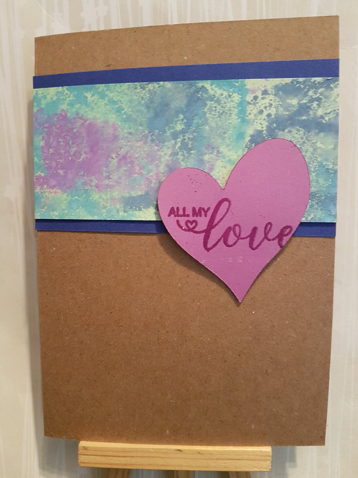
Project 457: A smooshed background valentine


The layout at CAS(E) this Sketch looked really good and I wanted to do something that was natural and not overly girly. I decided to go for a smooshed background in Distress Oxides and layer it against kraft, not white. I used a die cut purple heart that was left over from the card I listed yesterday and then heat embossed a sentiment that I got free from a magazine. I raised it on foam to give it a tiny bit of texture. I kept it super simple, I tried adding dots, bling, all sorts and I decided that keeping it plain was best. Really happy with this simple card, I think it's a great alternative to some of the OTT ones I've made before!

Sunday, 21 January 2018

Project 456: A masked heart valentine


I saw the challenge at Freshly Made Sketches and thought it would be a a fun one: 


 I know it said any shape but the heart in the sketch layout inspired me. I also saw that Paper Players is doing a CAS Love challenge as well as CAS on Friday doing a Valentine's challenge. 

I started by die-cutting a heart from a scrap and I used the leftover bit as a giant stencil. I blended a heart in Broken China Distress Ink and then added some Seedless Preserves in a stencil of hearts. I then die cut a peephole heart in the bigger heart to reveal the stencil detail. I heat embossed an arrow from a stamp set I have had for ages and then fussy cut it out. I don't love it, I kind of wish I had left it as a strip. Oh well. I added some pearls and a strip of black bling to add more texture. Really happy with it, nice way to start my Valentine's collection. 

Saturday, 20 January 2018

Project 455: A cherry blossom kimono for Sketch Saturday


Hello and happy Saturday! At Sketch Saturday we have one of our favorites joining us as sponsor this week. Fred She Said Designs!

The sketch is a really simple one and should definitely get your creative juices going: 


I started with a great image, Emma Smelling the Cherry Blossom. I colored her using Spectrum Noir pencils and then fussy cut her out. I used a stitched purple card and added a stitched pink border from a scrap I had on my desk. The background paper is a big watercolored cherry blossom pattern. I used a sentiment from the Tim Holtz Ideology sticker set, as I thought it was a lovely thing with the image. 

Looking forward to seeing what entries we get this week! 

Wednesday, 17 January 2018

Project 454: A day of NBUS


My desk fun continued and I decided to take a break from challenges to play with some more new stuff. These cards are pretty unrelated in technique and style but all involve a bit of new stash.

The headline card is one that was made with a stamp Claire gave me for Christmas. I heat embossed it in black so it would pop out. The background was made using smooshed Oxides in purple and red. I love the effect. I die cut it and thought it looked better on black than white. All week I've been playing with the stickers in Tim Holtz Ideology collection and I thought this one was particularly relevant to the image.


This is a bit of fun I had with a patterned paper in my stash. I got a new label die in a Technique Tuesday sale and realised I could make the pattern stand out around a sentiment. I used a circle die that I had erroneously cut out for another project so thought it could save it and repurpose it here. The stamp is from Paper Source and I used some little star and flower dies from the same die set to mask a little ink oops. But it's really modern and sharp and I think it's great.


This was made using a new paper pad that Claire gave me and a new rose die I got from The Works. I blended the paper in dark blue before die cutting it and then I embossed it in glitter powder to make it pop a bit more. The sentiment is also from Claire, it's a lot of fun. I kept the rest of the card clean and ornament free.

Had a lot of fun just pottering around the desk, even if the output is a bit random!

Tuesday, 16 January 2018

Project 453: CAS color and sketch challenge combo


I had some time off this week so I decided to have a play at my desk. I thought I'd combine the sketch challenge at CAS(E) this Sketch and the color challenge at The Paper Players and see what I could do: 


I have been wanting to use this Unity Stamp Co that Claire gave me and thought I'd give it a go as it sort of matched the layout in the challenge. I embossed it in navy powder and colored in the flowers using a mix of lime green and turquoise ProMarkers. I was going to close the wreath with a few individual flowers but when I was laying it out I decided that keeping it open was nicer. I added a Tim Holtz Ideology sentiment over a lime green scrap I had and I think it adds a modern touch where it could have been a bit twee. The colors are contemporary and that helps with the layout. Definitely happy with the combo.