Monday, 24 June 2013

Project 86: A Manchester Christening Card


So you may be wondering why the post is not just "a Christening card" and has "Manchester" as a qualifier. Well I'll tell you.

My friend Han asked me to make a card to make a card appropriate that takes into consideration the following criteria:
  • Christening card for a little boy with the initials OOB (feels like a breach of his privacy to reveal his name as he's less than 6 months old)
  • The couple live in Manchester and she writes for the Manchester branch of a national paper 
  • The mom is a Manchester United fan 
  • The dad is a Manchester City fan (I don't understand how they can live in the same house either)
Weirdly I don't have a "Happy Christening" greeting, or whatever you say on these cards. So I kept it simple and didn't put a greeting on it. I mean, the cross says it all, right?

I used red for the backing for Man U and then embossed a Man City blue card for the next layer. I thought it looked a bit severe so I used the blue gingham to bring back that baby-ness with the cross on top. I put his initials on it in gold (with the red for Manu again) so that it would be further personalised.

I put the stars on to balance out the layout but given the occassion, maybe they represent the Father, Son and Holy Ghost. Maybe I can get away with that being intentional?

I don't think I'm going to have a surge of Christening cards but I'm pleased with this one as a first go.

I have more cards planned this week...let's hope work doesn't keep me too late so I can get to them!

Tuesday, 18 June 2013

Project 85: Card set for the boss's wife


I work for a great company. We're a small agency and the two owners are fantastic at what they do, which makes it a great environment. Yes, it's still work. Yes, I groan as my alarm goes off in the morning. But working for this pair really is a joy.

We have our company bbq this weekend at the house of one of our owners. I really like his wife, who, let's be honest, is probably the one running around frantic now getting everything ready. We were told not to bring anything food or drink wise but my mother taught me the value of the hostess gift and I'm hoping this relatively tiny offering won't go amiss.

I saw this post on pinterest and thought it would be very occassion appropriate. The headline shot is my take on the card. Black and white is a safe combo and always looks modern. And with only one little pop of color you don't have to worry about guessing someone's preferences if you don't really know.

I decided to change the design a little bit from the original post by leaving out the greeting - I don't know her well enough to know if she's a serial note writer and without a greeting she can regift these if needed!

Here's the full set: 

I decided also to use different colors across all of them, with fun mismatching ribbons but use the same type of flowers to tie it all back together.

I embossed photo paper to gie it the glossy shine and then topped off the flowers with a pearl to mimic that shine and keep it classy.

The scallop behind the flower is die-cut rather than punched - my scallop punch was just that litlte bit too small and I didn't like the bubbly-scallops, I wanted something smaller and tighter like the die.

Gosh. I sound like a right prat there - criticising the volume of the scallop petals. There was a time very very recently that I wouldn't have even known the difference and would have been cutting those by hand.

Finally I used my little bubbly scallop border punch to give it that color lift at the bottom.

Considering I went from nothing to a set of 4 in an hour I'd call this a success. A glass of wine to celebrate I think...

Sunday, 16 June 2013

Project 84: Kenny K birthday and wedding cards


As the previous post was all about a Kenny K challenge I thought I should do a post featuring their stamps.

So here are three different stamps, one used two ways.

The headline card I left greeting-free. I really wanted to show off the 50s-style dress and thought a big ribbon would offset the whole thing. I used a spotty paper to tie in with her spotty dress. I glittered some of the spots but I’m not sure you can see that.
Really loved working with this stamp.


Next is a different take on that stamp, making it a birthday card for a friend. I used these colors specifically as they were her wedding colors. Again, the spotted paper ties in to her dress.


This one is a 20s style girl for another friend’s birthday. I’m purposely not using names as they sometimes stop by the ol’ blog. I loved the detail on this stamp, she’s so cute. I blinged up some of her jewels as well but again I’m not sure that’s visible here. 


Final Kenny K card is a wedding card for one of O’s former colleagues who are getting married this summer. I colored their hair to match the actual couples and then blinged up her dress with glitter and her bouquet with some bling. I used that same lattice punch for the double ring effect and then embossed the backing paper to make it more formal.


This last card isn’t a Kenny K (obviously) but as I made it this weekend I thought I might as well show it off. It’s for my friend Dave who just announced his engagement. I just got this heart ngratulations Dave!

Saturday, 15 June 2013

Kenny K naming challenge


Claire introduced me to Kenny K a few months ago and I've loved looking through their designs. They are quirky and modern and outrageous and I just love them.

So when I saw the challenge to name some of their new characters I wanted to play along.

What do you think?

1. Daisy Darling (she looks like Daisy Duke, no?) 

2. Marvelous Marisella

3. Ginger Gem

4. Really Rochelle

5.  Frankie Fierce

Ok the last two are embarassingly named after The Saturdays. But I love a good girl group!

Now I'm in the mood to go buy some more Kenny K....

Monday, 10 June 2013

Project 83: Girly stamps and not a birthday or thank you card in sight


Following up from yesterday, I had time to do a few more cards in my Father’s Day production line. All included a bit of fun with stamps and I thought I'd go for more interesting greetings than usual birthday and thank yous. 

The headline card is a card I made for my friend Hannah. She gave me this Big Ben stamp and I’m still smitten with it. I used a cool red and white paper that I’ve been saving for best and thought this was a good occasion. I used the bright blue to balance out the red. The greeting is a digital stamp that I coloured the shadow and added the little post-mark stamp to make it a bit retro.


Next is a Little Claire stamped card that I used to make an engagement card for my cousin. She’s got a bit of punk still in her from when we were teenagers and so I used the pink zebra paper to make it a bit edgy. I glittered some of the flowers and hearts to keep that special-occasion vibe.

This card is another Little Claire stamp and greeting set, from this month’s club newsletter. This one is for my friend Beth who has a special love of butterflies and all things pink. I used bright and light pink papers. I originally coloured the whole butterfly in but I thought it was too much so I re-stamped it and then just coloured and glittered some accents. The Martha punch and candies balance it out I think. 


Finally I made a set of hedgehog cards for my sister after she saw this post. I coloured them in, glittered it and used corresponding gingham papers for the background with a variety of greetings.

Very busy weekend as you can see!

And if you haven’t gotten around to it – order your Father’s Day cards now!

Sunday, 9 June 2013

Project 82: Father's Day and boy birthday cards


This weekend I had some time to do some serious card making so I’ve decided to break it into two posts. This one is a bit more strategic as I want to shift some of the output!

With Father’s Day around the corner I looked at Pinterest for some inspiration and found two copy-able designs. 


This one used a series of banners with a hand-stamped greeting. I have gone from pauper to prince in the papers front from some over-ordering at Craftsuperstore.co.uk so I decided to use a wide mix. I added the candies to give it a bit of hardware.

I hand-stamped the greeting using my building block letter stamps to bring in that homemade made quality. I figured the die-cut greeting base and banners made it grownup enough.I don't have an apostrophe stamp which is infuriating and makes the sentiment grammatically incorrect. Sigh.


Next is a card based on this pinterest sketch. I love the sunbeam and thought I could have them coming out of another die-cut greeting. It's fairly cute though I think next time I will use a full-width band like in the sketch. This time I used some die-cut letters to spell out Dad.

On a side note – I hate these letter dies. They are really tricky to work with and get the outside border to stay attached so I had to cut it off on most of these cards. Claire warned me about letter dies and I didn’t listen. She said they were expensive and a faff and she was right on both accounts. Sigh. 

Headline card is my post-production. I made 10, have used 2 and have 8 to order. So get in your requests quickly! If you tell me before Wednesday and I'm out of stock I will have time to make you one before Friday so you can post it for the weekend.

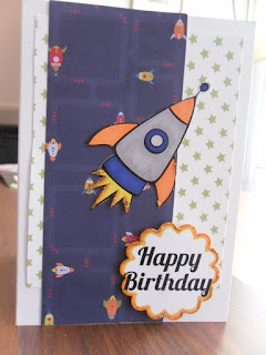
Finally I had two boy cards to make. One for my Father-in-Law and the other for a friend that is a loveable man-child. The rocket one is reminiscent of this card I made for a 7-year-old. I kept the green and black one pretty simple for my FIL, colouring in the digital stamp shading and punching a few stars in music paper and green to lift it a bit. I’m pretty happy with that as that could be mass produced if I get some big boy-card orders. Both have some subtle glittering as well (on the rocket flame and both greetings).

Next post is much more girly. Stay tuned :)