Tuesday 28 June 2016

Project 334: Heat embossed blending bonanza


I went a but nuts having fun with my heat embosser and blending. I was inspired by the Loft Art Retreat I did with Claire a month ago and using Distress Inks for all sorts of colored backgrounds. I mainly did blending here but I was considering the rules of color blending, starting with the lightest and tried to do more gradual builds instead of my usual pursuit of really deep colors.


For the headline card I embossed a giant rose stamp that was free from a magazine. I blended the background using Seedless Preserve and Broken China. The sentiment is from Sizzix and I love it. I think this is my favourite card of the lot. I tried it in Picked Raspberry and Seedless Preserve as well


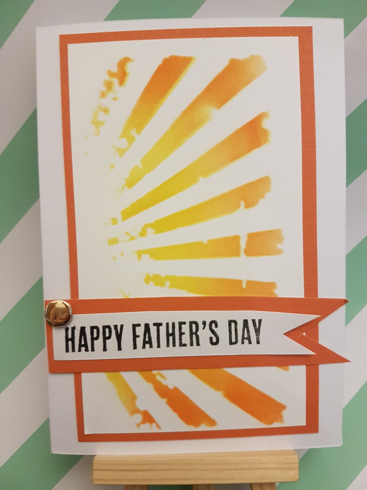
I did a variant using a wooden chevron stamp I have and really liked it, using bright citrus colors in Squeezed Lemonade, Mustard Seed, Carved Pumpkin, Spiced Marmalade and Mowed Lawn. Except then I dropped the greeting and it got this weird blurry effect. Doh.


For two of these, I had heat embossed and colored the backgrounds using the Distress Inks as paint. The reason these cards are so small is this was meant to be the feature image of another card, but then I changed direction and had both of these pieces as scraps. The Eiffel Tower is a stamp from a museum gift shop and the flowers are the repeated stamp of a tropical rose from Creative Stamping magazine about a year ago.


Finally a bit of fun - I used this great stamp featuring a line from The Legend That Is  Liz Taylor. It didn't emboss that well (I think words are always a bit tougher than images) but I wanted it to have a beach feel so I used Peacock Feather and Mustard Seed and Squeezed Lemonade. I wanted it to feel like a beach and I'm pleased with the result. The enamel dots are hand made by Claire and work perfectly. This is the only card I added embellishment to, the rest I wanted to keep clean and flat as I'm taking a big batch of these to my family as gifts. I think they'll be a hit.

Saturday 25 June 2016

Project 333: A stencilled thank you


I mentioned that I'm off to my brother-in-law's wedding and I've been spending a lot of time with my soon to be sister-in-law in the festivities. Her mother hosted us for an evening of pampering and I wanted to give her a little thank you to say how much I appreciated being included.

The headline card is her thank you card, which features a Tim Holtz stencil with distress ink in Fired Brick. The sentiment is the negative of a thanks die I had cut earlier and I loved how it looked with the stencil coming through. The big flower is layered up of a few different flowers and then I added some deep red enamel dots to finish it off.


As a little gift I made her a set of tiny mini cards featuring a purple gradient ink and wooden stamp courtesy of Claire. This stamp is one of my oldest and I love it in the gradient. I kept these super simple, I figure she can use them as gift tags or something. I hope she likes it, I plan to give it to her in Italy when we're all together for the wedding.

Thursday 23 June 2016

Project 332: A baby card for MAWTT


This week at Moving Along With the Times we have a baby challenge for you. I have had a lot of babies come into my life lately so this was a fun challenge.

I used a wooden stamp from Michael's that I picked up in a sale. I colored it with ProMarkers and die cut it out and layered on an embossed diecut sheet. The background of the paper is painted with an aquabrush and Distress Inks in Victorian Velvet and Picked Rasppberry. The elephant then got a wash of Wink of Stella sshimmer. The greeting is an old one from my stash and I stamped it onto a punched washi tape strip from Claire.

All in all, really a very cheerful card with a lot of technique but happily a CAS finish.

Can't wait to see whatyou do in the next two weeks!

Tuesday 21 June 2016

Project 331: 7 year anniversary card


My colleague is celebrating his 7th wedding anniversary. He asked me to  make a card that incorporated copper and/or wool and peonies as that is his wife's favorite flower.

I couldn't find a peony stamp in time but this rose stamp has a nice folded centre that could probably pass as a peony. Kind of. Sometimes we have to make things in our stash work hard for us. I heat embossed it in pink powder and added the glittery 7 in the corner.

For the copper bit, I took a little brass key I had and painted it orangy brown and added some gold glitter to lighten it. To get the wool in I took a cotton wool pad and die cut out 4 hearts to symbolize the 4 members of his family.  The background is a Trader Jane pink paper that I love for its richness. The sentiment is die cut and then to make it stand out a little bit (I liked it sort of hidden)I covered it in a wink of stella shimmer.

Love it now that it is finished, I think the couple will love it as well.


Monday 20 June 2016

Project 330: Fun feather birthday card


My sister's birthday is coming up (actually it's a few weeks away but I'm super organized this year)  and as I had her gift ready I decided to make her card. The sketch at CAS(E) This Sketch intrigued me and I wanted to find something to make it work.


I had a bit of serendipity because I was looking for something else and found these fabric feather stickers in the process. Result. I painted them with an aquabrush and Distress Inks in Picked Raspberry, Mustard Seed and Peacock Feather. The sentiment is a Studio G stamp and I colored in the letters using ProMarkers. The background paper is a new one from Claire that I loved and had to use straight away.

It's pretty silly and juvenile but my sister will love it I think.


Sunday 19 June 2016

Project 329: A light and cheerful wedding card


In just a few days now we are heading off for Tuscany to celebrate my brother-in-law's wedding. They are a fun couple and I wanted their card to be more light hearted than the usual cards I make for weddings. 

I used the fun Kenny K stamp and colored it to match their likeness, including my BIL's beard. I die cut it out and used a fun American Crafts confetti paper as the back. I then used Tim Holtz Ideology stickers, mounting a handful that Ithought were wedding-related to ccolored banners I had as scraps on my desk. Even wedding cards get some scrap action! I liked this instead of a formal greeting, this felt much more them. 

Really happy with the final result, I think it will definitely be a layout I look to in the future for more relaxed cards.


Thursday 16 June 2016

Project 328: A stencilled father's day card


I don't normally do batches of Father's Day cards as they don't sell as well as Mother's Day cards. But a handful of colleagues had asked about it so I decided to knock up a handful of them.

The sketch at CAS(E) this Sketch was perfect this week for a simple card that I could do in succession:

The stencil is Tim Holtz and I used Distress Inks in Mustard Seed and Mowed Lawn for the headline and Mustard Seed and Carved Pumpkin below.


The stamp is a new one from Claire gave me and it's so clean I love it. I added the brad to complete the sketch and make it a bit more masculine.

Hopefully they'll sell!

Thursday 9 June 2016

Project 327: Donut father's day card


It's almost Father's Day and after making my dad a wine-based card I wanted to do something different for my father-in-law. He's not much of a wine buff but he does have a pretty good sweet tooth. Which made me think of my kick-butt donut stamp set.

I started with a die cut circle in beige paper and cut a central hole out. Then I did a smaller ring in brown and hand cut the edges to look like icing. I stamped the little sprinkles on in colors that would stand out.
I wanted to feature the donut stamp but it was too busy to have it as a full background. So I did it as a border instead, stamping first the full ring in beige, then adding frosting in white pink and chocolate and then adding a sprinkle layer in a contrasting color.

The checker paper makes me think of old fashioned paper wrappers. The sentiment is die cut out of a central strip and I layered it against the same dark brown. The extra greeting is from the donut set.

This may be the card that has brought me the most card-making joy than anything I've made in ages. It just tickles me!


Monday 6 June 2016

Project 326: Yellow wellies for birthday


A colleague asked if I would make a birthday card featuring yellow wellies for his mom. I have this great Little Claire stamp that I knew would be perfect and when I saw the layout in Sketch Saturday I thought it would work well with the image:


The background paper is from Studio Calico. The image is colored with ProMarkers and then cut using nesting Sizzix dies. The greeting was a freebie from Creative Stamping magazine. The yellow spotted ribbon is ancient, I think it's American Crafts. Really pleased with how it came out and I hope my colleague likes it.


Sunday 5 June 2016

Project 325: Painted congrats card


My cousin just got her MBA and I wanted to make her something special to celebrate. I saw the sketch at CAS(E) this Sketch and thought I'd try a new painted idea I had been wanting to try:


I used an aquabrush with Picked Raspberry, Seedless Preserve and Victorian Velevet Distress Inks to get the watercolor effect. I varied the height to match the sketch. I heat embossed the greeting in black to make it stand out against the pale colors. The sequins add a touch of glam and I think it's a great finished project. Will have to try the technique again!

Saturday 4 June 2016

Project 324: Wine cork father's day card


I wanted to make a Father's Day card for my dad using this great Darice cork embossing folder. The colors at Color Throwdown this week were perfect for a wine-related card.


The background is actually darker green but when I flipped it over I preferred the inverse. The greeting is die cut from a scrap I had on my desk that I thought fit the color scheme. I put it against dark brown to stand out more and added a strip of woodgrain paper. It's pretty simple but I wanted to keep the cork pattern the hero and I think the simplicity makes it more masculine.