Saturday 27 September 2014

Project 180: A CAS double challenge


This has been a hectic week and so I was desperate to spend some time in the craft room to unwind.

I was feeling too drained to do any colouring so I was looking for a project that had a few elements I could piece together without needing a big coloured image.

When I saw the layout at Freshly Made Sketches this week I knew it was going to be what I needed:

 
I also took inspiration from Color Throwdown


I used a Kaiser Craft stamp down the left hand side to create the pattern in brown ink directly on the craft card. I used the same dark brown ink to add an edge around the tag and stamp the hello greeting. 

The heart and mustache combo are from Recollections at Michaels. The green and white ribbon is so fun, I have been saving it for ages and decided to use it for the green accent. I got it ages ago from a sale at my local sewing store and what I was saving it for is beyond me! The sequins and bling give it that scattered and random feeling. 

Pretty CAS this week but I think that keeps it pretty modern. Feeling much more relaxed now that I've had a chance to craft!


Thursday 25 September 2014

Project: Debut MAWTT DT 3-2-1 Challenge


I am super excited to be leading my first challenge at Moving Along with the Times this week!

I love challenges that give a bit of interpretation so I decided to set a simple recipe: 
  1. Image
  2. Papers
  3. Colors 
I love Little Claire stamps so I wanted to use one for this challenge. The hot air balloons are a set of three and I thought they worked well in the cheerful orange, yellow and burgandy colours, all colored with ProMarkers.

The yellow paper is oragami paper from Tiger and the orange corrugated card is so old I couldn't tell you where I got it.

I wanted to add a few embellishments and so I looked for a heart that matched the same yellow. I added the orange chevron ribbon under the orange paper and touches of glitter to the balloons.

I can't wait to see what you all do with the recipe.

I hope you enjoy the challenge, I can't wait to see what you do!

Thursday 11 September 2014

Project 179b: An alternative woodland creature card


I just posted about my friend who asked me to create some lovely little woodland creature cards a while back.

Feeling the woodland theme a bit further, I got this great little set of woodland digis and this little skunk holding a flower caught my eye. She's so sweet and when I saw that Digi Chooseday were having a monochromatic theme I decided to have a bit of fun and make her green. Why not?!

There was something attractive in making them green rather than traditional black and white.

I colored her with a series of green ProMarkers and then die cut her using a scallop circle die, followed by a green scallop for baking. I added a strip of green gingham to make it a bit more cutesy and added a punched and pressed paper flower with a green bling for detail. It was a bit busy for a stamped greeting so I added a foam-padded greeting instead.

And after a bit of glitter and a candy I left her be. Some things need to be simpler rather than more complicated!


Project 179a: A foxy girl double challenge


My friend a while back commissioned some woodland creature cards and asked me to consider a few more options for different people.

So I decided to have a look at a few things for her starting with my lovely Gorjuss foxy girl stamp from Claire. She's such a sweet image. I saw the colors in the Color Throwdown and knew they would work brilliantly with her.


Needing a bit more inspiration I used the sketch from Freshly Made Sketches this week to give a layout:

I used ProMarkers to color her in and decided to go a bit punk with blue hair. Why not?! I backed her on green paper and punched out a starry border to go with the pattern on the dress.

I added the stitched blue ribbon instead of a paper border and added a knot where the sketch from Freshly Made Sketches has an embellishment.

It's a bit hard to see (pardon the light - it's late here in London as I write this!) but the backing paper is a lovely fine-lined grey chevron paper to go with the grey in the scheme. Just a little extra touch.

I hope my friend likes it as much as I do!


Project: Grey, black and red texture card for MAWTT


This week we have a texture challenge at Moving Along with the Times. This can be interpreted in a lot of different ways - embossing, fabric, layers of embellishments - lots of options! 

I used an embossed card from Claire, featuring a funky collage style pattern. I layered this with a grey star paper and divided the two with a black and grey ribbon. 

I added extra texture by using silver glitter over some of the embossed features and added some bling and sequins for a bit of shine. 

The label is die cut and layered with another diecut greeting from my stash. 

It's a bit more masculine than I intended but all the same I love how it has turned out. 

Looking forward to seeing how you interpret the texture brief! 

Monday 8 September 2014

Project 178: A London travel card


A friend at work asked if I could make her a London card for a friend who was traveling to visit. She saw the one I made a few weeks ago and asked for the same stamp but with the request to make it "more British, more festive!"

I saw that Digi Chooseday Challenge had a travel theme this week and I thought that would be a great entry for their holiday challenge as my friend is giving it to her friend visiting London for the first time.

The image is a Penny Black stamp that has been scanned and printed - a DIY digi! Makes it more consistent and easier to work with when doing orders like this! I colored it using ProMarkers and backed it on red paper.

The blue background is embossed with a Union Jack - fulfilling my "more British" requirement. And I cut out some Union Jack bunting from an old Jubilee paper stack to fulfill the "more festive" brief.

She wanted it greeting-free so I called it a day - very pleased indeed. Now for a spot of tea to call it a British-inspired day.


Sunday 7 September 2014

Project 177: A double sketch challenge


I love a Skype playdate - don't you? :)

Today Claire and I had a little adventure with Freshly Made Sketches as our inspiration. Here was this week's challenge:

We did a few takes on it but I like the headline card the best.

I started with a stamp from a craft magazine years ago - I think I bought the mag just to get that stamp - and die cut it out using a scallop circle. I slightly inked the edges in black to give it a bit more depth against the patterned paper.

Next a I used a KnockOuts lined scallop punch for the border. I added a metal Thank You I've been saving up for the right card - I think it really works here with the papers and image. Finaly I added a candi for balance. Not too complicated but really nice impact I think.

 I thought I'd show you another take I had on the sketch:

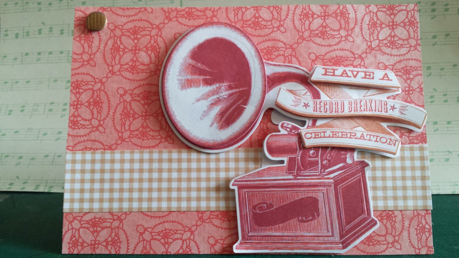
 This uses a fun 3D layered die and banner set that is totally hipster. I used a pink paper from the Neopolitan stack from Recollections and a strip of brown and white gingham that is from my scrap stash. It's such a busy image I left it that simple!


Project 176: A bright and citrusy bumblebee


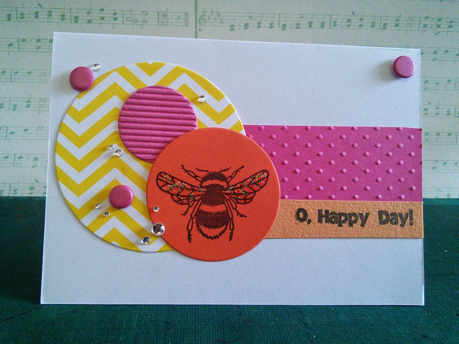
I had a bit of a Craft Superstore splurge this week (oops) and got this killer bumble bee stamp in a sale. I don't know why but it spoke to me!

I saw that Color Throwdown were doing a great challenge of bright colors and I decided it would be a great challenge to make the bee's debut:


 I stamped the bee onto orange card and die cut out a circle. I love a bit of mixed texture so I die cut a smaller circle in corrugated pink card and a bigger one in yellow chevron paper. The pink card was textured with a Swiss dot embossing folder for another layer of texture. The candies and rhinestones add a bit of cute bubble-like bling to coordinate with the other circles.

I added a small banner of orange card for the greeting which is a new one from a set from Claire. Such a cheerful group of colors and patterns warranted a cheerful message. 

And full disclosure: this covers an "oops" moment when I stamped directly on the card and it went badly. 

Sweet and simple for a Sunday.
 

Wednesday 3 September 2014

Project 175: KennyK wedding card in pink and purple


My friend Rowan is getting married this weekend and I am gutted that I'm not able to go as we have a conflicting event. To (try to) make it up to her, I thought I'd make her a fabulous card !

I love the Happy Couple stamp from KennyK and so I thought I would enter their challenge 179 this week.

I colored the stamp to match the couple and then die cut a large circle with a backing purple circle to frame it. I punched silver and purple card using a heart scallop punch in the Knock-Outs range as a border. The heart is a scallop punch in purple with the couple's initials and a few heart outlines to jazz it up.

It's a fairly straight forward layout but I think it works rather well!

Monday 1 September 2014

Project 174: Woodland creatures cards


My friend Hannah always gives the best commissions. I have mentioned her so many times on this blog I should give her a category of her own for tagging.*

She asked for an owl card for a friend and "an adorable woodland creature" card for her sister.

I wanted to giver her some options so it kick started a bit of a woodland theme in the craft room!

The headline card is actually for a different friend, Palo, but I sent this to Han as a layout option for her to consider. The owl is from Little Claire and is colored with ProMarkers. I added a texture of gold and brown inks over top to give it that aged look - I stamped it on white and when I decided to go for the cream card I had to make it muted so it didn't jar against the rest of the papers. I die cut it in a circle and then added a backing blue circle to make it stand out.

The printed craft card is from a Michael's pack, and the butterflies are from the same set. I tore the paper to give it a rougher edge and then just tied a bakers' string around it. I punched the butterflies out with an EK Success punch and then I colored the edges with ProMarkers to give them some extra dimension.

I punched a red spotted paper with a Knock-Outs border punch and then added my friend's name in peel offs for extra personalisation. It is a lot of layers and steps but I think the final product is great.


Next up: the beaver card. This one was designed around some chipboard shapes I had that I thought were perfect for the brief. I embossed a strip of brown paper in a woodgrain pattern to give it that woodland feel and topped it with a green gingham ribbon. The banner is stamped and cut from card stock and I topped it with a candi. 


This little owl card is based on a different chip board sticker set that I had. I used a yellow heart oragami paper from Tiger and added the tan spotted ribbon, from Michaels. The orange paper is scallop punched from a Hippie Chick card stack and then the little tan banner is actually a washi sticker - stamped with a greeting. If Han doesn't take this one I definitely will! 


Finally and oldie but goody, a Stamping Up punched owl. I used a mix of spotted papers in blue and brown and layered this over an off cut of the embossed woodgrain paper from above. The greeting is from Claire, a stamped message cut with one of her label tags. 

All were super fun to make - I wish I could keep all of them but then again - this is a business! 


*I may actually do this.