Thursday 26 May 2016

Project: Age related sentiment at MAWTT


Hello everyone! Welcome to another Moving Along with the Times challenge. We want to see an age related sentiment, whether it's a message about ageing or a specific number, we want to see what you can come up with.

My entry is a card for my sister-in-law, who's turning 30 just ahead of her wedding in Italy. Very exciting times! I personalised her card by tying in the Italian theme, using the Neapolitan sticker and paper set from Recollections. I had to layer it over white as the sticker wasn't opaque enough over the patterned paper - which I hope looks like gelato to match the Italian theme!

The greeting is from Endless Birthday Wishes from Stampin' Up and the glittery stickers are from Claire when she did a mad letter sticker dive at JoAnne Fabric (I think?).

It's pretty simple, the hardest part was the fussy cut around the sticker. I thought it looked best simple so I let it be. Can't wait to see what you all come up with!


Tuesday 24 May 2016

Project 323: Magic sketch card


A while ago I saw these Tim Holtz Christmas dies in a sale and I splurged and bought them for myself and Claire, namely because I loved the 'Magic' that was included. Claire, being awesome, bought me this bunny and hat stamp and die set from Avery Elle as a supplementary gift. Isn't it fab?

I saw the sketch at Sketch Saturday and thought it would work well.

And as I <3 ProMarkers are having an anything goes challenge I thought I'd enter there as well.

I used glitter tape on the background and then colored the stamp with ProMarkers and die cut him out. The magic die is covered with glossy accents though I must confess I don't love it, I was a bit too heavy handed! The rest of the greeting is made up of gold letter stickers, stamping was too hard with the glitter paper.

It started on a black card blank but it was all a bit too heavy so I cut him out and put him on a white square and I'm much happier!


Monday 23 May 2016

Project 322: Boy birthday sketch challenge


I am getting a bit ahead of the game and wanted to make some cards for events in the next month because these weeks are incredibly busy. My father-in-law's birthday is coming up so when I saw CAS-ual Fridays were doing a boy birthday challenge I knew I would enter.

The sketch at CAS(E) this Sketch was perfect for what I had in mind.


I started with a stenciled background using Distress Inks in Mustard Seed, Spiced Marmalade and Carved Pumpkin. The bird is a Tim Holtz stamp that I won recently and I colored him with ProMarkers and then fussy cut him out. The balloons are from a Stampin' Up punch Claire recently gave me. The sentiment is from a set from Creative Stamping magazine, it is a new favourite.

The bird is so weird and wonderful, I know he'll be a firm favourite in no time.

Sunday 22 May 2016

Project 321: Sunny sketch challenge


I thought I'd try my hand at a stenciled background as it's a new technique I've just learned. I have hesitated for years and now that I've tried it I love it. The sketch at Freshly Made Sketches looked perfect for it:


I used a Tim Holtz mini stencil and used Mustard Seed Distress Ink for the background. The two ribbons are both American Crafts. I added the crab die cut which is one of the oldest dies I have - Claire and I love them! I gave him blingy eyes and added the sentiment from Lawn Fawn.

So sunny and fun, this was a great first foray into stenciling on my own.


Saturday 21 May 2016

Project 320: Blended color leaving card


A girl on my team is leaving this week so I wanted to make her a special leaving card. She's very girly and loves pink so the colors at this week's Color Throwdown challenge were perfect for her:

I started with a Unity Co stamp that I heat embossed in black. I blended over it using Distress Inks in Victorian Velvet and Picked Raspberry for an ombre effect. I layered it over a pink and white spotted paper.

The first half of the greeting is from the Unity Co set (Stay Beautiful) and the second half is a new one from Stampin' Up (and eat cookies). I mounted it on grey to bring in that tertiary color from the color combo. All stamps are brand new from Claire, was so much fun to play with them. I think my colleague will love it, I'm thrilled with this result.


Friday 20 May 2016

Project 319: Simple flower free thank you part 2


Following on from yesterday's post on flower-free thank you cards, here's the second batch I made to give my colleague some choices.


The first uses the Sizzix dies that I bought in the Black Friday sale. They are so easy and I used scraps for the brown, orange and green greeting (which is a Sizzix for Stampin' Up die). The little blue triangles were a recent purchase from my trip to the US with Claire and I thought they added a nice little detail to add some texture and accent.


The second card is a fun one, I heat embossed this fossil leaf stamp from Inkadoo and then blended the background using Burnt Sage, Mustard Seed, Squeezed Lemonade and Mowed Lawn. I used the same thanks die and added some yellow pearl accents.

With the previous 2 it took about 45 minutes to make all 4 cards, I was happy that I was able to make a bunch of different styled cards so quickly and add some new fun layouts to the mix.

Thursday 19 May 2016

Project 318: Simple flower free thank yous part 1


My colleague asked if I had some thank you cards at my desk and when I showed him the selection I could tell they just weren't right. They were for people he didn't know that well and he thought they were all a bit too flowery. He asked if I could make some that were just bold prints or something a bit more masculine.

I went home last night and cooked up a few different options. The two I'm showing here are using a patterned card blank that have really lovely colors and patterns. The headline card features a Stampin' Up 'Tap tap tap' stamp and I added the greeting with a different set that has been in my collection since the beginning of my crafting. I fussy cut it out, mounted it on red then blue and then added some gold dots just for a few extra touches.


This second card is from the same set and I blended it using distress inks to get the red background. I tried another technique I learned this weekend (more to come on that) but it didn't really work so I tried again and kept it simple. I added a black die-cut thanks for the greeting and left it at that.

I'll add a few more ideas I tried out tomorrow!

Wednesday 11 May 2016

Project 317: A simple card with origami paper


My friend just returned from Japan and gifted me with a beautiful set of origami paper as a souvenir. It's such a colourful pack, full of rich colors and detailed patterns. It's so precious I'm nervous to use it!

I wanted to make a card for her as a thank you that really showcased the paper. I decided that this multi-patterned paper would work really well as a backdrop for something simple like a border punch. I settled on the Martha Stewart birds on a line punch after much deliberation. I was worried they wouldn't stand out enough but with a shimmery purple paper they seem to do the trick.

The sentiment is from a pack of sentiments Claire gave me as it has EVERYTHING in there. I liked this little variant on the thank you as it carries a bit more emphasis and emotion and I liked that for such an understated card.

The photo hasn't come out that well I realised, it looked sharp on my camera but now looks a bit blurry - unfortunately it's already sealed up in its envelope so I'm going to have to leave it as it is. Oh well!

Thursday 5 May 2016

Project 316: Custom wedding cards


Is there anything more personal than someone's wedding? I love to make personalised cards for my friends and love to add details when I get briefed to make something for someone else.

Today's post shows 3 different cards that I hoped would capture different personalities.

The headline card is from a wedding we attended this past weekend. The couple got married at the very grand St Pancras Renaissance Hotel in London and they had an art deco theme of black, white and gold to go with the grand interior. I chose paper that I thought matched the theme and then colored and fussy cut this awesome KennyK wedding image to match their hair and skin tones. There are touches of liquid pearl in her tiara and earring but it was hard to capture in the photo. The banner is a Simon Says Stamp die and it's actually only half of the banner - it doubles up normally - but I thought this gave it a good balance.


This next card uses my favourite wedding cake die and a washi tape bunting trick I learned from Pintrest. You fold the tape over a string lining a piece of card and cut the bunting so it's easier to manage. Then I hid the ends of the string with metallic candies to look like brads. So simple! This was a commission from a colleague so I asked her for colors and she said bright and cheerful but still traditional. She said it was a posh country wedding so bunting felt like the right choice. I thought the spots were a fun modern touch and the roses added some texture. Finally the date was stamped using a new little stamp I got from Tiger with individual letters and numbers. 


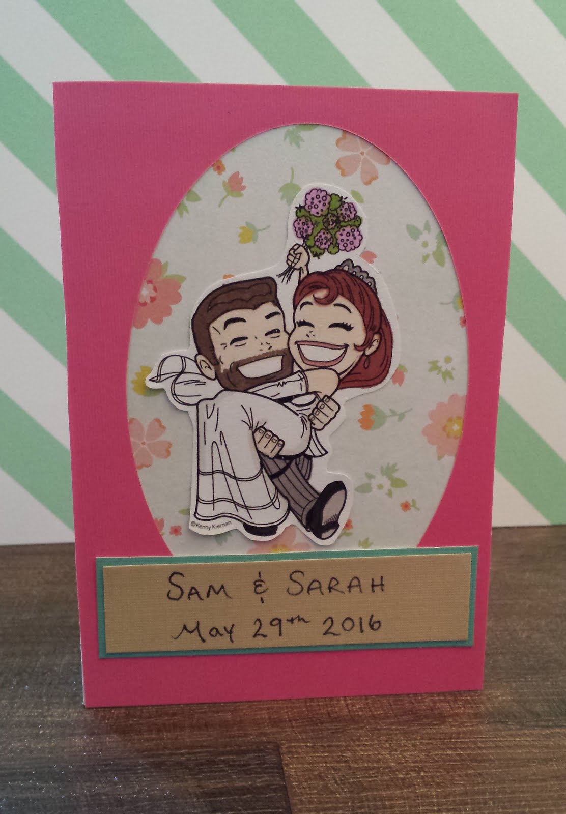
This last one is for some of my home friends getting married in a few weeks. They are such a fun couple, very natural and laid back, and so I thought I'd make this one a bit less fussy and more relaxed. I used the off-cut of a pink card that I'd cut an oval out of and used that to frame the same KennyK stamp, colored to look like them and fussy cut out. I layered it over some floral paper that I thought made it look like an old time-photo and then hand-wrote their names and date instead of stamping it. Just felt more natural for them. It may be a bit too plain - I may jazz it up in the few weeks between now and the wedding!