Showing posts with label Candies. Show all posts

Sunday, 9 September 2018

Project: Age is irr-elephant card


My dad loves a corny 'dad joke'. He cracks himself up, even when nobody else finds it funny. For his birthday this year I decided to use these silly animal pun sentiments to honour his sense of humour.

The layout at Freshly Made Sketches was perfect for this:


I started by stamping the elephant stamp directly onto a woodgrain patterned paper. I tried a few versions on plain paper and it was really lacking something. The woodgrain gives it depth and a bit more masculine I think.

The sentiment on its own was missing something so I added the black background. Smallest things make the biggest difference. I tried adding candies and other things but it was really best plain so I took off all the extras and stuck with it as it is. I had already been through a bit of detail drama as explained below...


Originally I stamped the elephant on this paper. The test I did was fine but when I finally committed it using my stamp platform it was way too busy. But because I was going for a one-layer look I couldn't get rid of the image and decided to cover it up. I used a Hero Arts sentiment and rainbow image stamped onto a circle die cut and then I found an orange paper to match the backing paper. 

So this oops got fixed pretty quickly - often these things kick around my desk for months waiting to be corrected and I decided to find something to fix it straight away. Glad I did, even if it is a bit ofw-center for my liking! 


Thursday, 5 July 2018

Project: Two takes on animal cards


This weekend I had a playdate with Claire and she talked me through using a new pull-off die she sent me and I decided it would be perfect to play with my fun little marching band animal set.

I started by die cutting the white strip on a scrap so I could see how it worked. I chose far too small a scrap so that limited my ability to choose the rest of the components! I know this for next time...I then stamped, colored and die-cut the animals. I stamped the first part of the sentiment on the tab of the pull-off and then on the backing piece added 'happy birthday' so there is a good reveal. I mean, it's an obvious one but I think the big adult kids in my life will love it.


This one has nothing to do with the first but as I was playing with Claire I decided to do some stencilling over a stamped image. See this post of her's for the inspiration she gave me! I stamped the hummingbird first and then stencilled over it using a mosaic Tim Holtz stencil with Distress Ink. I used his range of stickers as well as a bit of fun. Then I went old school and added twine and candies - it's like the cards I used to make in layout but with some more contemporary techniques. 

Playdates always encourage me to use the newer and more challenging tools! 

Saturday, 20 January 2018

Project 455: A cherry blossom kimono for Sketch Saturday


Hello and happy Saturday! At Sketch Saturday we have one of our favorites joining us as sponsor this week. Fred She Said Designs!

The sketch is a really simple one and should definitely get your creative juices going: 


I started with a great image, Emma Smelling the Cherry Blossom. I colored her using Spectrum Noir pencils and then fussy cut her out. I used a stitched purple card and added a stitched pink border from a scrap I had on my desk. The background paper is a big watercolored cherry blossom pattern. I used a sentiment from the Tim Holtz Ideology sticker set, as I thought it was a lovely thing with the image. 

Looking forward to seeing what entries we get this week! 

Saturday, 9 December 2017

Project: Star Stampz Christmas cards x2


This week at Sketch Saturday we have a fun sketch sponsored by Star Stampz. Truthfully, I couldn't choose an image so I made two cards with the sketch because I was that indecisive. Here's the sketch:

The first is just so silly. This one is called Christmas Tangle and I colored her using Spectrum Noir pencils and fussy cut her out. The background paper has been in my stash for ages and though I worried it was a bit too busy it gives it a lovely retro edge that I was looking for. I stamped the sentiment on a label that I cut from a newsprint paper. I added little glitter accents to the string of lights and then added two black candies to complete the sketch.


The second one is a bit simpler, featuring Santa's Letter which I also colored using Spectrum Noir pencils. The sentiment is an ancient banner I have, maybe my first ever Christmas sentiment set, and is a bit tricky to use but I think it works well as a headline banner. I added some really lovely stitched ribbon and two shiny red stars to complete the sentiment. Both were great fun to color, I really do love the sponsor this week.

Be sure to do a sketch before Friday to join the fun!


Tuesday, 23 May 2017

Project 418: Using die cut scraps


I had a fun little play date with Claire this weekend and while we were chatting on Skype we both did a bit of a desk clear out. I had so many scraps of paper, die cut things and random stuff on my desk I decided I wasn't going to do anything new until I had made a dent in the left overs. It's an eclectic collection but I am really pleased with the results!

Headline card: the feathers are a mix of dies from my stash; the blue was embossed and cut by Claire and gifted to me and the green is a die cut I made for another card but then didn't use. The stitched grey square is left from another project (another reject where I found a better pattern to use for that piece) and the red paper is the edge of a paper pad that I have had for ages. The bow and sentiment tag are also ancient from the collection. By intentionally ignoring color and pattern, I think it's actually come together really well instead of getting fussy about everything being matchy-matchy!


For these dog cards, I had bought this big die in a sale and then immediately got a bit afraid of him. He's really big! He doesn't always come out cleanly either as you can see from one of the examples, but I decided it was ok as long as the brow and fur at the bottom are out, it doesn't matter. Both backing papers are scraps that had been awkwardly cut but because I love both patterns I just kept them forever. Why?! The turquoise and tan card has a heat embossed sentiment from Creative Stamping magazine and the one with the tartan paper is stamped from a different magazine freebie. Even the white banner on which it is stamped is a scrap!


For this one I used a big sentiment cut from Claire's silhouette machine that I have been saving (again, why?) and some little stitched rings over a scallop circle. The paper is a bit too busy for the sentiment but never mind, I think the colors worked well here given they were all scraps and not cut for purpose.


Finally this little guy was made using a stamped and die cut bicycle from Sizzix over a blue die cut star. The red card was already cut to size and I embossed it using a Stampin' Up folder. A simple sentiment and some star bling and I called it a day. 

So relieved to have a clear desk, now all I need to do is clutter it up again :) 


Wednesday, 8 February 2017

Project 394: Animal birthday and valentine cards


I got so much lovely stash for my birthday from Claire that when I got home I wanted to play with everything. My mojo hasn't been up to scratch lately and I thought it would be fun to make just a few things and not get too stressed about it.

The headline card is a birthday card for a friend who shares my birthday (today!) featuring Bugaboo pigs, stitched dies from Claire's Christmas present and a gorgeous background stamp that I inked in Salty Ocean Distress Ink and spritzed. The pigs are colored with ProMarkers.


The second card here features a new Valentine set. I embossed the little paws in white, blended over it in Candied Apple Distress Ink. I fussy cut the stamp and then stamped a sentiment combining three of the messages together. There are so many little sentiment options with this set, it's really sweet. I added the little strip of red gems, I'm not sure it's in keeping with the rest but oh well!

It took me a while to get back into the swing of things but I had a lot of fun with these two. hopefully the inspiration will come back as I play with all my other new things!

Sunday, 4 December 2016

Project 380: Stenciled succulent cards


I'm still experimenting with my Black Friday purchases and today's post features a new Spellbinders die set I got. Claire and I love succulents and I love her die set that she has so I went looking for something similar.


I decided to make small 4x4 square cards as the dies are fairly small and I wanted them to be prominent. I used Tim Holtz stencils and Wild Honey Distress Ink for both. The headline card also features Squeezed Lemonade as a background color as I thought it needed a bit more. I left the card below white but added Mowed Lawn as the die also works as a stencil. The sentiment is an old one from a Fiskars set courtesy of Claire. I thought it worked really well here as the style is both modern and a bit 70s retro. I topped them both with a metal candi as I thought it needed just a hint more. Could be masculine or feminine, I'm really pleased with how they turned out.

Thursday, 10 November 2016

Project: Die cut numbers and letters for MAWTT


This week we have a fun challenge for you at Moving Along with the Times: die cut letters, words or numbers. I wanted to challenge myself so this card features a few more techniques that I hope will inspire some projects!

I die cut the HB2Y on a small tag die and layered this over a kraft card tag. The twine keeps it masculine but still a bit playful.

The border was masked off and then blended using a number of Distress Inks. Claire commented that the bottom bit was a bit naked I got out a stencil from Tim Holtz and added some Wild Honey stencil in a line so it overlaps but doesn't compete.


Just as a freebie: I made another tag birthday card as I liked the layout above and made this one really simple. Two stamps from the same Fiskars set, with a fun patterned paper and yellow punched stars.

So another fun little challenge from Moving Along with the Times - get those dies out and play along!

Tuesday, 25 October 2016

Project 371: Blended autumnal fox card


I was having a bad day and my guru Claire suggested I make a card that involved blending as she knows I love it.

I saw the sketch at Sketch Saturday and the photo inspiration at Retro Rubber and thought they would work well together:


I used a combination of Distress Inks to get the two colors for the background and blended them to get the depth. I laid down a stencil of a dandelion and spritzed water over it and dabbed over it to get a bleached effect. I then used a rich blue ink to stencil in the little fly away dandelions. It's a bit more blue than I anticipated but I guess the image is pretty blue as well.

The fox is a Unity Co stamp that is from last September, so just over a year old. The greeting came with the stamp set, and I love it, I can't believe it's been lying idle in my collection for so long. I colored it using Distress Inks and an aquabrush. The red paper is a scrap from American Crafts.

It's a bit busy, but I like it, it soothed my bad mood so i could enjoy what was left of the evening.

Saturday, 6 August 2016

Project 342: Die cuts and textured backgrounds


I had a really great play session in the craft room today and I decided to use some of the textured scraps or backgrounds I recently accumulated. I thought dies would be a fun way to keep things simple.

The headline card has a background that Claire created - I stole it from her mixed media bag. I loved the colors, stamped with that gorgeous hexagon and spritzed to give it some groovy variation. I layered it in ollive and added the maroon Stampin'Up bird punch. Love the simplicity and the retro colors.


For this one, I featured an embossed card where Claire had added ink to the folder. She didn't love it but I thought it would look great with my robot. I love working with a star behind him and thought the color worked brilliantly with this folder. I added tiny little dots of paint for texture and added color. Love this one as well.


Final one here! For this one I used a woodgrain stamp in Stampin' Up khaki dye ink directly on a kraft card square blank. I used a tree die that Claire gave me and I've struggled to use it for a while. But then I had this idea to add little flowers and suddenly it's transformed. I added little gold dots and a greeting and it's a cute little card.

Really happy to go back to basics with these and I have to remember in the future that simple things can make great projects.

Monday, 25 July 2016

Project 338: A simple but colourful wedding card


My husband's former colleague got married this weekend and I wanted to make them a card that was a bit different and special. She's from a big Indian family (as is her groom) so I wanted it to be a bit more colourful than my normal cards as the celebration was all about rich vibrant colours and amazing fragrant food and flowers.

The background paper was my starting point, it's from Recollections and the foil gold really pops. The champagne glass is modelled on my AbFab card and hand cut out of glitter card stock (this was my last sheet! I can't believe I've rationed it for so long!). The hearts are die cut using my Xcut nesting wonky hearts. The sentiment is from Endless Birthday Wishes by Stampin' Up and I decided it it needed bit more so I added a line of beige pearls.

It came together really quickly but because of the pretty background I think it still looks special and hope the couple liked it. July posting has been a bit slow with a few holidays so trying to get back into it!

Thursday, 16 June 2016

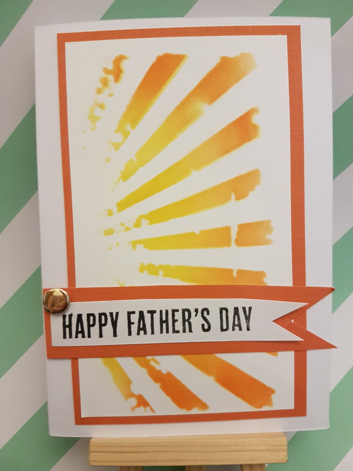
Project 328: A stencilled father's day card


I don't normally do batches of Father's Day cards as they don't sell as well as Mother's Day cards. But a handful of colleagues had asked about it so I decided to knock up a handful of them.

The sketch at CAS(E) this Sketch was perfect this week for a simple card that I could do in succession:

The stencil is Tim Holtz and I used Distress Inks in Mustard Seed and Mowed Lawn for the headline and Mustard Seed and Carved Pumpkin below.


The stamp is a new one from Claire gave me and it's so clean I love it. I added the brad to complete the sketch and make it a bit more masculine.

Hopefully they'll sell!

Thursday, 5 May 2016

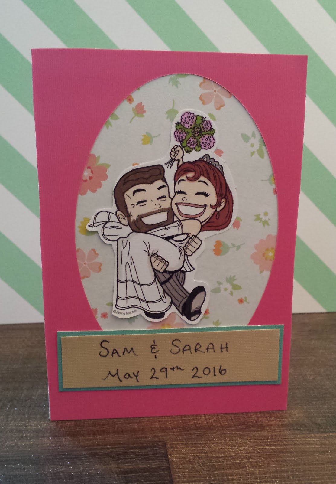
Project 316: Custom wedding cards


Is there anything more personal than someone's wedding? I love to make personalised cards for my friends and love to add details when I get briefed to make something for someone else.

Today's post shows 3 different cards that I hoped would capture different personalities.

The headline card is from a wedding we attended this past weekend. The couple got married at the very grand St Pancras Renaissance Hotel in London and they had an art deco theme of black, white and gold to go with the grand interior. I chose paper that I thought matched the theme and then colored and fussy cut this awesome KennyK wedding image to match their hair and skin tones. There are touches of liquid pearl in her tiara and earring but it was hard to capture in the photo. The banner is a Simon Says Stamp die and it's actually only half of the banner - it doubles up normally - but I thought this gave it a good balance.


This next card uses my favourite wedding cake die and a washi tape bunting trick I learned from Pintrest. You fold the tape over a string lining a piece of card and cut the bunting so it's easier to manage. Then I hid the ends of the string with metallic candies to look like brads. So simple! This was a commission from a colleague so I asked her for colors and she said bright and cheerful but still traditional. She said it was a posh country wedding so bunting felt like the right choice. I thought the spots were a fun modern touch and the roses added some texture. Finally the date was stamped using a new little stamp I got from Tiger with individual letters and numbers. 


This last one is for some of my home friends getting married in a few weeks. They are such a fun couple, very natural and laid back, and so I thought I'd make this one a bit less fussy and more relaxed. I used the off-cut of a pink card that I'd cut an oval out of and used that to frame the same KennyK stamp, colored to look like them and fussy cut out. I layered it over some floral paper that I thought made it look like an old time-photo and then hand-wrote their names and date instead of stamping it. Just felt more natural for them. It may be a bit too plain - I may jazz it up in the few weeks between now and the wedding! 

Monday, 4 April 2016

Project 306: A special going away card for a friend


My friend Beth is moving this weekend and while I'm so happy for her. It's a huge step for her and her relationship and a wonderful opportunity for her to pursue happiness after a few very hard years. But I'm going to miss her!

I also wanted to tap into the Anything Goes challenge at Retro Rubber this week. The sentiment has been in my collection for about 3 years and the butterfly is at least a year. Maybe 2? I have so many lush butterfly stamps that it's hard to keep track!

She loves all things girly and pink so it had to be a butterfly card. I decided to make it up lifting and make it a little shaker, so I stamped the background and just colored the background with ProMarkers in rose pink and amethyst. I used pink foam I got from the pound shop in the kids' art section and then I was able to just add the plastic as I didn't need to mask the foam ring, just made it part of the design. I love making shakers with beads, they are so colourful and rattle around so well.

The sentiment is big and central and I added a little tie around it and some pink metallic candies. The colors don't really go and I didn't love the extra details but I remembered it was for her, and she likes OTT bling and texture and that pacified me!


Saturday, 27 February 2016

Project 299: Papercut personalized mother's day cards


Two of my colleagues asked for very specific mother's day cards this year and, as ever, I like to do something a bit different with a personalized brief. Both are papercut because I thought it was the best way to meet their specific needs.

The headline card was made for a friend whose mother is an Egyptologist. In real life! He said that we should go for a good old fashioned mummy gag and asked for the sentiment specifically. The rest was up to me. I decided that, since this is one of the oldes puns in the book, I would go for a really modern look. I made a mummy shape and then wrapped it in strips of white paper. Harder than it looks, I should mention! I then die cut the sentiment in purple to introduce some color. Finally I added the bling strips just to make it a tiny bit more feminine. Weird twist on the old gag, I hope he likes it.


This card was commissioned by a colleague who said her mum is setting up her own yoga business and wanted to show her taking on the world. I cut out a silhouette of the downward dog position and then cut out some green countries for my globe. The countries were so much harder than the person, honestly I am never paper cutting a globe again. They're not nearly good enough for how much effort and redoing it involved! I layered these over some cloud-patterned vellum, I'm loving this at the moment and have used it several times recently. I tried a version with a sentiment, sent pics to my colleague and we both agreed blank was best.

Really happy with the final products and how different these are from anything else I've ever made for Mother's Day!

Sunday, 21 February 2016

Project 297: Mother's day is so early this year


This year everything is happening early. Easter is in March. Ash Wensday was barely into Feburary. And UK Mother's Day is like tomorrow. ok. Not tomorrow. But so soon. I've only just stopped pushing cards on my colleagues for Vday and now we're into the next big one. Sheesh.

So I hit the ground running this morning and knocked up about 10 cards to start the base of what I'm going to sell .


The headline cards are probably my favourite for the simplicity. I colored some Bugaboo flowers and colored them with ProMarkers. I diecut them out with nesting ovals. And added a candi. Done. People can tell me what they want written in the middle and then it's personalized. Sweet.


This next one is also a Bugaboo image, also diecut on oval, but backed against a cheerful pattern with a Martha border punch and Die-Versions Mother's Day sentiment. Yes I even kept the little die-cut apostrophe. Punctuation is a big deal.


Finally, you may remember this card from Valentine's Day - I had a few left over so I added a die-cut sentiment and updated it. Best repurposing of a card I can think of.

Probably need 1 or 2 more designs but I think this is a pretty good start.

Monday, 25 January 2016

Project 290: Trio of Valentine's day cards


In the run up to Valentine's Day I decided to make a bunch of simple cards to sell at my office. I usually do a mix of 'serious' (more traditional hearts and roses and stuff like that) and fun and I've learned that the fun ones always sell better. So this year I thought scrap tradition, go all fun.

Here are three that I made during a playdate with Claire on Sunday.

The headline is my favourite - these are from Unity Stamp Co and I decided to go simple and pared back, just colored ink against the card stock with some corresponding ribbons. I made 4 color combos  using green, blue and pink as the base and changed up the ribbons for each one.


Next I made these little submarine cards, using a set from Stampin' Up. The images are die cut on Sizzix nesting ovals and colored using ProMarkers. I added a patterned paper as a layer in four different colors. I looked at bling and candies but thought plain was best.


Finally I did these little froggy cards from the same stamp set. The greeting was just 'toadally awesome' so I used the 'You are' from a Unity Stamp greeting and just masked off the rest of the greeting. Pretty pleased with how they came out actually! They're die cut using a stitched circle and then a plain green circle scallop die.

I have a few more pun-tastic ideas for Vday messages but I'm pleased with these as a starting point. 12 down - I think if I can get about 20 made then I'm good to go. Watch this space :)

Sunday, 10 January 2016

Project 284: A personalized Steam Punk thank you


As you know, my buddy Mrs G is in town for work this week (and she works with me so it's more fun than it sounds!) and I wanted to do something a bit fun and different to give her a special thank you for her thoughtful Christmas presents.

I love this KennyK stamp, it was one of my first steam punk items and I just decided to revisit her. She's colored with Spectrum Noir colored pencils and I cut her out using a Sizzix nesting oval die. The die slipped slightly as I rolled her out so she's not quite center. No matter: I used this funky gothic border stamp down the side to add some texture. It doesn't quite work does it? Never mind, fills the space, makes it less noticeable!

I colored her in greens and greys and used the Chronology set for my backing paper. I didn't add a sentiment as I'll write her the message inside and I know she loves the KennyK images so she'll be happy with the card.

The only challenge I'm entering is the KennyK Challenge - keeping it simple this year!


Thursday, 17 December 2015

Project 280: Fruity day thanks


I had a mini playdate with Claire this week which was brilliant. We exchanged our $20 challenge gifts and revealed we had bought each other the exact same quantity of things, with 3 of the items almost exactly the same. How funny is that?

She also brought a gift that she was sharing as a craft friend of hers had given her a set of Spectrum Noir pencils and she generously shared these with me. As a thank you to her friend I wanted to make something using my new stash.

I loved the fruit stamp and die set and thought it would be a great feature. I blended the background using Peacock Feathers distress ink and then stamped the fruit slices and die cut them out.

I added the greeting from my new Sizzix stamp and die set and heat embossed it in black to make it stand out. The little candy matches the darkest tones of the distress ink. Super happy with it and I think it was worth all the little steps to make something a bit cheerful for Claire's friend.

Tuesday, 24 November 2015

Project 278: A double set using Stampin' Up sets


A few weeks ago Claire came to visit and brought with her a big order I'd placed with her as my Stampin' Up rep. There happened to be a sale on at the time so I took advantage...to say the least!

As Christmas approaches, I'm always looking for ways I can personalise presents and give people something specifically made for them. Card sets are a great way to do that and I put my new kit to the test making a few sets.

The headline card uses the 'Tap tap tap' set and I kept these pretty simple. I stamped the typewriters on a cream grid printed card from My Minds Eye and used an accent red or black print paper for the border from the same set. I used 3 different sentiments and kept one blank to give them a variety. I added a silver candy for a bit of hardware. I have the recipient in mind and she'll like them, I'm fairly confident!


The second set features 'You're sublime' a set full of funny puns and I just thought these would be perfect for another friend. I stamped them all out and colored them in using ProMarkers. Then I die cut them using a stitched circle die and layered them over a textured vellum paper I cut using a scallop circle die. I rarely use vellum and here I'm just using it as a normal backing paper...it went well with all my colors and thought it would let the stamp stand out but not look too plain.

Neither took too long but they're really well suited to the recipients. That is what it's all about!