Showing posts with label Weddings. Show all posts

Wednesday, 5 September 2018

Project: A simple anniversary card


This week it is my 8 year wedding anniversary and I wanted to make something fun but simple as a card for my husband.

I love these Gorjuss stamps, I have about 4 or 5 of them and they are so lovely but I find them a bit hard to use sometimes. Maybe I just don't try hard enough. Anyway, this one is a personal favourite, I think she was my first Gorjuss stamp and I love the little heart card she's holding. I decided it was perfect for the anniversary card.

I colored her using Spectrum Noir pencils and tried to make her hair a bit like mine (but hers is glossier and shinier as I'm too lazy to blow dry) and then I fussy cut her out as she's a simple shape. The heart is a giant punch and I stamped over it using a love stamp set that I got at a craft fair earlier this year. I added the sparkly 8 for our 8 year anniversary as it's the same color as the heart.

It's simple but sweet and I think it's perfect for the occasion!

Monday, 30 July 2018

Project: Giant ring sketch engagement card


A friend at work just got engaged and I absolutely love his fiancĂ©, she's a good laugh and someone I seek out at work events when people bring their partners. 


The sketch at Freshly Made Sketches looked like it would be fun to play along with so I did some sketching to see how I could make an engagement card work and it came together much easier than I thought! 

I started with a white piece of card and I die cut it into a rectangle with a spotted border die as I wanted it to match the spots on the sentiment. I then heat embossed the square stamp in a gold powder and then I really carefully blended the edges in Broken China distress ink. I just wanted a hint of blue as the white was really stark and I didn't love the contrast before I blended, it looked unfinished rather than CAS and the touch of blue evened that out. 

I die cut a piece of glitter stock paper into a ring using two circle dies and then used a big comedy heart gem stone from the pound shop.  All in all a really fun little card that stays playful and CAS. Job done :) 


Sunday, 13 May 2018

Project: A lovely Bridal Shower challenge entry


I decided to play along with some challenges this weekend to make a Bridal Shower card for one of my best friends. She's Beatle-mad and I thought this All You Need is Love sentiment + die set would be perfect - I just needed to make a card around it.

So the combination of colors at The Paper Players and the layout at CAS(E) This Sketch were a perfect combo as she loves pink and orange:


I made an umbrella out of pink and orange papers to go with the 'Shower' theme (it is tradition after all) and I used a heart stencil to add some raining hearts to the background paper. I die cut the 'love' sentiment in yellow and orange for texture. I added a lime green border of heart scallops to add the fourth colour.

So while it's a wedding card it is super summery and cheerful - not the usual white-on-white. I think she'll like it and it was a fun way to get some inspiration this weekend.

Tuesday, 31 October 2017

Project 446: A technique-rich anniversary card


Claire and I always like to show off in our cards for each other and even simple-looking cards should feature some hidden complexities.

As it's her wedding anniversary I wanted to make her something fun and cheerful. This card features a few fun things, including a new toolset she gave me this summer. She introduced me to Distress Oxides and this card features three colors though the yellow all but disappears with the pink and orange. I then spritzed a stamp with water and laid the card on top to get a bleached chevron. I then used punched hearts (that I think I got when Claire lent me her scalloped heart punch years ago) and then used a die to get the sentiment.

It looks simple but it's cheery and fun and the colors of a Tequila Sunrise - perfect for recognising their honeymoon in Mexico!

Monday, 3 July 2017

Project 423: A hen-do collage


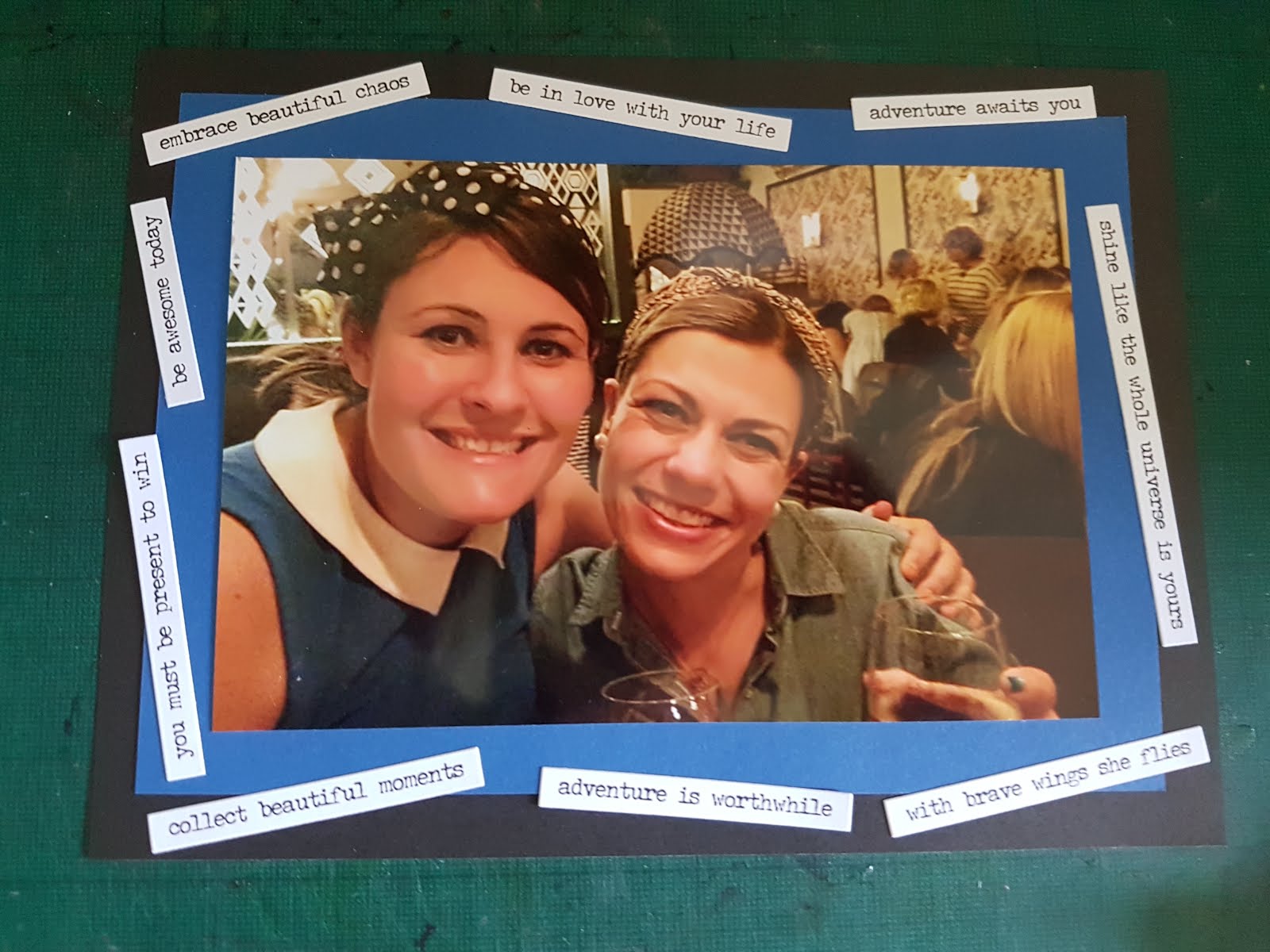
I got asked to print photos to contribute to a friend's bachelorette party/hen do book and it occurred to me that I have so few printed photos this was going to be really hard! I scanned all of my social media accounts and decided there was only one good recent photo of us but, as a friend of 12 years, I couldn't go with just one little image so I decided to supplement the only way I know how: with crafting!

I made my dies do most of the heavy lifting, and added detailing in enamel accents to the dart board and the college crest (that's our Oxford college where we met). She lives in Hong Kong (thus the dragon) and lived in Italy (thus the flag) and loves to travel. The bottle is more symbolic of how we pass our time - lots of casual drinking!


And this is the one image I did decide to print, which I jazzed up with some stickers from Tim Holtz's Ranger range. I was pretty happy with the result, it definitely stands out amid all the other photos!

Monday, 20 March 2017

Project 408: A musical die cut wedding card


Two friends are getting married and, while their wedding is totally low key, we're super excited for it. Rarely do you meet a couple that feel so well suited for each other, right from the off.

I have had this musical paper from the Neapolitan Recollections set for ages and it just feels perfect for the couple. The groom was our best man and him and my husband have gone to concerts together since they were in high school. He was in a band until his early 20s with some of our friends and my brother-in-law and music is a big part of his identity.

Once I found the paper I decided to rummage in my pre-die cut folder to see if I could find something fun. I was looking for a die cut sentiment but came across this nice little doily and a sparkly cake die and thought they'd go perfectly with the paper so changed my plan. I added their initials in navy and topped the cake with a sparkly heart bling.

It's a bit country-fair twee, which is what I wanted, and I think the couple will love it next week when we give it to them. Super easy but really personal as well.

Tuesday, 21 February 2017

Project 398: A collage wedding card


A good friend asked me to make a wedding card for a couple he has been friends with since high school. They have been together since they were teenagers and decided to get married to make things easier as they buy houses, move countries and generally change their lifestyle by the year!

He gave me a brief of things that would mean something to them - they travel a lot as a group of friends and so he requested a number of things to represent their adventures. Plus booze and food that feature regularly - it's something I can certainly relate to!

I started cutting out everything from plain card stock, I didn't want to have to draw too much (mainly because I'm terrible at drawing) and paper cutting always looks a bit different. People tend to be more forgiving as well!

The bicycle is a stamp that I die cut out (and then cut out a few pieces more), and the ham, beer stein, cheese and lime slice feature some pen detailing. The little grapes on the cheese board (hard to see) and the tulips are a punch (I colored the leaves green to avoid pink stems and leaves). The gin and tonic and champagne glasses are filled with glitter glue to look like liquid (I was pleased with that detail, I'm doing that again). Finally I made a Malta flag to represent her heritage and a destination they often return to.

It's in the post to go to my friend now, I think he'll like it and more importantly I think the couple will like it!

Monday, 31 October 2016

Project 372: A Day of the Dead anniversary card


I got these great puffy decorative skulls from my friend Carrie who came to visit and I knew immediately that they needed to be used for Claire and Sam's wedding anniversary card.

I heat embossed a Stampin' Up set and it came out really fuzzy but I thought it actually worked better. Not an oops, I'm embracing it. I blended over it in really bring colors, stopping half way through the card so that it was just the bottom half and didn't conflict with the skulls.

I layered them over some translucent plastic disks that came from Claire (I think they were with a purchase of something else?) and thought the colors went really well, especially since one had a big ampersand printed on it. I added a few smaller plastic dots and some black enamel dots to top it off, with a hand written greeting as I didn't want the sentiment to get in the way of the busy colors and textures.

Really happy with it - hope they like it too!


Monday, 25 July 2016

Project 338: A simple but colourful wedding card


My husband's former colleague got married this weekend and I wanted to make them a card that was a bit different and special. She's from a big Indian family (as is her groom) so I wanted it to be a bit more colourful than my normal cards as the celebration was all about rich vibrant colours and amazing fragrant food and flowers.

The background paper was my starting point, it's from Recollections and the foil gold really pops. The champagne glass is modelled on my AbFab card and hand cut out of glitter card stock (this was my last sheet! I can't believe I've rationed it for so long!). The hearts are die cut using my Xcut nesting wonky hearts. The sentiment is from Endless Birthday Wishes by Stampin' Up and I decided it it needed bit more so I added a line of beige pearls.

It came together really quickly but because of the pretty background I think it still looks special and hope the couple liked it. July posting has been a bit slow with a few holidays so trying to get back into it!

Wednesday, 20 July 2016

Project 337: Absolutely Fabulous wedding card


My colleague asked me to make a wedding card for her friends that was Absolutely Fabulous themed. I was delighted by the brief and then almost immediately panicked because I didn't know how far to go!

I liked the layout at CAS(E) this Sketch and wanted to find a way to make it work:


I started with a champagne glass - I figured I could make it work if I had a champagne glass. I cut the first out of card to use as a template and then cut two more out of vellum. I chose one with tiny flowers and another with tiny lines (courtesy of Claire) as I thought they looked like bubbles. I stuck down the vellum but I hate the glue mark you get - I was trying to make them stand up with foam tape but that looked even stranger.

I layered this over the brilliantly sparkly magenta kiss paper I have been saving 'for best' from my first ever Recollections pad - Femme Fatale - that my sister bought me when I first started crafting.

I printed the sentiment (my colleague asked for it specifically) and kept half above the paper, half below so that it would mimic the sketch.  I tried an alternative with more muted colors/papers and a blended background but it really wasn't working for me. By that point I'd had a chat with a friend over Skype and a cocktail and my brain was disconnected from proper crafting.

Hopefully my friend (and her friends) will like it as much as I enjoyed making it.

Sunday, 19 June 2016

Project 329: A light and cheerful wedding card


In just a few days now we are heading off for Tuscany to celebrate my brother-in-law's wedding. They are a fun couple and I wanted their card to be more light hearted than the usual cards I make for weddings. 

I used the fun Kenny K stamp and colored it to match their likeness, including my BIL's beard. I die cut it out and used a fun American Crafts confetti paper as the back. I then used Tim Holtz Ideology stickers, mounting a handful that Ithought were wedding-related to ccolored banners I had as scraps on my desk. Even wedding cards get some scrap action! I liked this instead of a formal greeting, this felt much more them. 

Really happy with the final result, I think it will definitely be a layout I look to in the future for more relaxed cards.


Thursday, 5 May 2016

Project 316: Custom wedding cards


Is there anything more personal than someone's wedding? I love to make personalised cards for my friends and love to add details when I get briefed to make something for someone else.

Today's post shows 3 different cards that I hoped would capture different personalities.

The headline card is from a wedding we attended this past weekend. The couple got married at the very grand St Pancras Renaissance Hotel in London and they had an art deco theme of black, white and gold to go with the grand interior. I chose paper that I thought matched the theme and then colored and fussy cut this awesome KennyK wedding image to match their hair and skin tones. There are touches of liquid pearl in her tiara and earring but it was hard to capture in the photo. The banner is a Simon Says Stamp die and it's actually only half of the banner - it doubles up normally - but I thought this gave it a good balance.


This next card uses my favourite wedding cake die and a washi tape bunting trick I learned from Pintrest. You fold the tape over a string lining a piece of card and cut the bunting so it's easier to manage. Then I hid the ends of the string with metallic candies to look like brads. So simple! This was a commission from a colleague so I asked her for colors and she said bright and cheerful but still traditional. She said it was a posh country wedding so bunting felt like the right choice. I thought the spots were a fun modern touch and the roses added some texture. Finally the date was stamped using a new little stamp I got from Tiger with individual letters and numbers. 


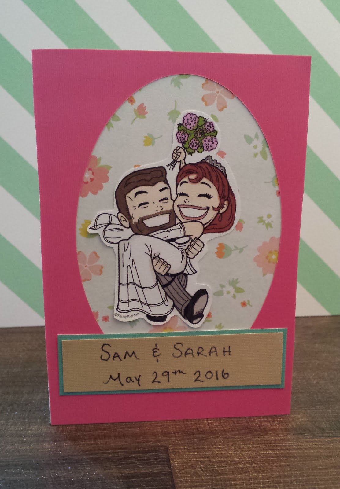
This last one is for some of my home friends getting married in a few weeks. They are such a fun couple, very natural and laid back, and so I thought I'd make this one a bit less fussy and more relaxed. I used the off-cut of a pink card that I'd cut an oval out of and used that to frame the same KennyK stamp, colored to look like them and fussy cut out. I layered it over some floral paper that I thought made it look like an old time-photo and then hand-wrote their names and date instead of stamping it. Just felt more natural for them. It may be a bit too plain - I may jazz it up in the few weeks between now and the wedding! 

Sunday, 14 February 2016

Project 296: Using dies for a custom wedding baby card


I was asked by a colleague to make a card for her brother, celebrating his wedding and birth of his son. She was very specific, asking for gold rings, green and blue to be the colors and the reference to both occasions. I struggled with this one to be honest!

I decided to use my Tim Holtz letter dies and decided type would be my friend - why be symbolic when you can literally spell out what you need to say! I spelled out Mr & Mrs and put them over some hand-cut banners.

I spelled out Baby in peel offs as I thought that would tie into the Congragulations at the bottom. I hate those peel offs they are so thin and hard to use but they're really elegant so they stay in my collection. I added three little hearts to represent the three people in the family.

The rings are die cut out of gold paper and overlapped to make an infinity sign. I added the heart ribbon as an extra little touch. It's a bit busy but I think it's on brief and she'll like it.


Also: I made this cute little mini card using my blooming marvelous set from Stampin' Up - stamps and dies on a 3x3 card. Was pretty quick and easy and using all scraps it was a nice one to throw together. Need to keep this in mind!


Wednesday, 20 January 2016

Project 289: A cut out engagement card


Short post today: my friend Mandy is engaged and for her card I wanted something simple and personal. She is a math teacher and I thought using grid paper would be a fun way to work that in. I cut out their names using Tim Holtz letter dies and then topped it with a little heart stamp from Recollections.

I kept it really simple and I think it's a bold look for a card, compared to the usual (often feminine/girly) engagement cards. Must remember this for the future!

Tuesday, 3 November 2015

Project 272: Personalized engagement card


A great friend of ours just got engaged and we are so delighted. I wanted to make them a personalized card to celebrate and took the opportunity to play with one of my new favourite die sets: an alphabet set I bought with Claire at The Ink Pad in NYC.

I started with an X-Cut lopsided heart die, adding in the initials of the couple using the new dies. I love these dies because they work just as well in negative space as they do with the cut out.I lined the left hand side of the letters with gold glitter glue to make it stand out more.

I didn't want anything too formal - I wanted it to feel light and fun and I think the greeting does that well instead of a traditional Congrats. The papers are from Studio Callico and they are so cheerful.

Finally I topped it with a candy that matched the turquoise paper.

Amazingly, I did this without my ATG as it broke this weekend. I am not coping well with this so if anyone has tips on how to fix it when the trigger stops releasing the tape, please share!! 

Saturday, 31 October 2015

Project: Heat embossed anniversary card


I wanted to make something special for Claire's wedding anniversary so I set myself a challenge of using at least 3 tools and techniques.

It is her 6th anniversary so I decided to feature 6 stamped hearts that were heat embossed over a blended background. The stamps are from a Recollections set and she bought them for me as part of our $20 Michael's challenges that we set each other. The backround is a stitched die which completes my tool/process challenge. The sentiment is a combination of two peel off sets: I like the mini 'It's your' from a birthday set and liked the outcome of mixing fonts.

I can't wait to give it to her and wish her many more happy years!


Saturday, 10 October 2015

Project 262: A monochrome and blue wedding card


Tonight I'm going to the wedding drinks of friends I used to work with. That's right - I know both the bride and groom from previous jobs: sometimes the world is just a very small place! They actually got married in her home country of Romania and this is the big London party to celebrate with their friends here.

The are a cool couple, and from the wedding pics I saw it looked like she had a cool blue fascinator in her hair so I wanted to make blue an accent color in an otherwise monochrome scheme.

I wanted to feature this cool cake die but was struggling with a layout so I browsed around and thought the sketch at Sketch Saturday would be perfect:

I started with the cake die (which is from a sale, maybe Dies R Us?) on photo paper for a glossy shine and layered that over a grey card that I embossed with swiss dots (folder from Cuttlebug). The Mr & Mrs ribbon is by Recollections from Micheal's and the blue sentiment is from Stampin' Up. The grey ribbon is adhesive and by American Crafts. The damask print paper makes it a bit busy but I think it's ok - I like the overall texture that's created. The litle flowers are so old from my stash.

I can't believe I stumbled across this sketch just minutes after it was posted - I don't think I've been the first to post a card in a challenge ever! :)


Monday, 31 August 2015

Project 248: Mix of die cut cards for mom and sis


I’m gearing up from a trip to see my sister and mom soon and I always like to take a collection of cards with me as a gift. 

This time I decided that instead of a matching set I’d make them each a few blank cards that they could use for their own occasions, featuring some of my new craft kit. I’ve loved using feature dies recently and thought this was a fun way to make up a collection of new cards.

The headline card and this one here are using a new Stampin’ Up die and stamp set that I haven’t played with much since Claire gave it to me.  Just been so busy this summer! I decided to use a few of the layers, stamping complimentary colors for the middle layer and then a standout color for the inside of the smallest one. I added die-cut leaves and glittered the spotted pattern for extra texture. The backing papers are all from Trader Jane Recollections stack and I love how exotic they feel. 

Really like these both. With a bit more practice they probably wouldn’t be so time consuming to cut and layer up either!

These next ones are just a bit of fun with my cake dies. I went for two layouts against black and white backgrounds. I added just a touch of bling, flowers and bows. That die is so stand out really don’t’ need much else to make a special card.


Finally I made a bunch of kit cards using stitched circle dies against craft card. These kites are from Claire and her mom and I love them. They are the easiest, most playful embellishment I’ve played with in a long time and I know my mom and sister will love them as well.

I made some robot cards as well – see this post as they are exactly the same -  so there are a bunch of different things to choose from. I can’t wait to see them and I’m sure they’ll like these new dies as they have received so many of my old ones over the years! 

Saturday, 29 August 2015

Project 247: Special anniversary card


This week is my 5 year wedding anniversary - the 'wood' anniversary.

We always have a touch of the traditional in our anniversary celebrations and so I wanted to have wood as part of a central theme on the card. I always incorporate purple into our anniversary cards as well as it was the color theme for our wedding.

My colleague gave me this amazing wooden card stock - yes it's actually super thin wood! I decided to die cut  these lopsided hearts as a nesting set of 5 as a tribute to our five years together. I added the purple layers as this is a remnant from paper I used in our wedding favours - amazingly this is from my last sheet.

The backing paper I have had for years and years - I loved the colors here and thought it made it a bit more masculine. The sparkly 5 is from a set Claire gave me. And that's it really! I thought the hearts were such a good feature I'd just leave them be. I can't wait to celebrate - we're taking Friday off to go to a Michelin-starred lunch in London and then maybe a gallery - who knows what he has planned beyond that!

Monday, 17 August 2015

Project 242: Double die-cut fun


Claire brought me some amazing dies from a sale in the US and this weekend I spent some time playing with them. I chose two complicated ones as features to see what we could do with them.

For this headline card, I wanted a fun, playful card to feature this robot. I chose three patterend backgrounds for my cards and then used the largest of an Xcut nesting stack of stars to cut big backgrounds out.


The robots were a bit fiddly but they worked well against the stars.I raised them with foam so they would stand out more. It took only a little effort (most of it getting the little robot bits out of the die cut) and I had 3 different varians.


Next I wanted to play with this intricate cake die. My cousin's wedding is coming up so I thought it was a good way to put it to the test. I decided to go for a neutral beige theme throughout as an elegant scheme. The Mr and Mrs die cut is from Claire in a pack she sent me a while back. The background paper is from the stash but I couldn't say from whom as it's just been kicking around my drawer loose (the shame of a messy desk). Finally I added a bit of pearl bling to give it a touch of class. Really simple but pretty I think.

These were all really simple to make but because of the intricacies of the dies they really look modern and as if they took ages. That's a win in my book.