Thursday 18 December 2014

Project: Sketch challenge for Moving Along with the Times


This week Hazel is hosting us with a sketch challenge at Moving Along with the Times:
To meet the sketch I decided to go for a masculine color and image scheme and decided to use some cool new stamps I got recently in a steam punk set. I stamped an all over cog pattern from Papermania onto grey paper and then die cut the circles.

I then stamped a clock pattern onto blue card and die cut that in a larger circle. I decided to outline the inner and outer circles in silver liquid pearl when tragedy struck and the middle circle smeared!

I decided to to make it part of the design and add a diecut ring to look like it's the inner workings of the clock. I then stamped the inner part of the clock onto another card and punched it out to add yet another layer. Not sure if it's quite saved but it's certainly better than it was with the liquid pearl problem.

As there was quite a lot of stamping I opted for a peel off greeting and then topped it off with some candies to complete the sketch. Finally I inked all of the edges with blue and purple ink in order to give it some more texture and rough-it up a bit.

I'm really looking forward to seeing what everyone else comes up with for the sketch!

Wednesday 10 December 2014

Project 195: A very Minion Christmas


My colleague asked me to make a special card for her boyfriend. Her brief? "He likes minions." Right then!

I wanted to do something bold and different so I stuck with paper cutting and folding. I die cut the glasses and eyes and santa bauble but everything else was cut by hand. The hat is a precut triangle banner Claire bought me at Michael's. I left some bits overhanging for extra dimension.

It has been so long since I made a card like this and it was a little hoot for a Wednesday night. Hopefully she thinks it fits the brief!


Monday 8 December 2014

Project 194: An alternative travel Christmas card


I had a bit of a splurge at Michael's on Black Friday this year and this amazing Tim Holtz travel stamp pack ended up in my trolley. I did a bit of a road trip with my husband and inlaws this year out West, going (briefly) on Route 66 while we were travelling through Arizona. My inlaws love nostalgic Americana and so I decided to make them an alternative Christmas card to remember our trip.

It just happens to fit in perfectly with I Love ProMarkers' challenge this week as well!

I stamped the image and added small touches of color using Berry Red and Lush Green ProMarkers. I then punched the border in metallic green paper using a Martha Stewart scallop punch.

There are some glitter glue details on the car and then a shiny gold candi in the corner. I added a Jolee's santa hat sticker to give it an extra little wink.

Simple layout and greeting free- I wanted the stamp to do all the talking here!

Sunday 7 December 2014

Projet 193: A neutral metallic Christmas challenge entry


When I saw the colors at The Color Throwdown this week I knew I had to join - they are such a pretty combination and a nice alternative to the traditional green and red Christmas.


I'm also trying to enter Retro Rubber's challenges as I need to be using my older stamps (as well as all of the gorgeous new ones I keep buying...) so I tried out their sketch challenge this week as well:

The stamps I chose for this card are from a Fiskars set that was given to me by Claire about 2 years ago. I think it might have been part of my birthday present before she left for NYC in Feb 2013 but I could be wrong...memory is getting a bit hazy during the party season :)

The stamps are on natural cardstock and then layered with a metallic silver paper. I punched white snowflakes and added touches of gold glitter glue to add a few more textures. The three candies are from a new set ("brownie") that I just bought (admittedly I went a bit candi mad recently and bought 6 new types. Oops.) and the top right is from "wedding bells".

Almost finished my Christmas cards now...just gotta get them in the post!


Thursday 4 December 2014

Project: Christmas climate at MAWTT


This week at Moving Along with the Times we have a Christmas Climate challenge: whether you celebrate Christmas in a hot or cold environment we'd like to see a project that reflects what it is like for you.

I bought the "There's no people like Snow People" in a sale for 50p years ago and I love to dig it out when I do a snow-related card.  I stamped it onto silver card and die cut the scallop shape.

The white and blue papers are embossed with a snowflake folder that I bought in a sale this summer from Sizzix - since getting my Big Shot a few weeks ago I've been a bit die cutting and embossing crazy!

I topped it with a spotted grey ribbon and some sequins and left it pretty clean as a layout. With so much indulgence for the holidays I like to keep some things minimal!

I can't wait to see what everyone else does with the climate challenge.


Monday 24 November 2014

Project 192: Fun little feather case


I had a special birthday card to make for a friend and I decided to go to a board on Pinterest I haven't visited in a while. I was so glad I did as I great card that I wanted to case:


Sadly the link didn't go through to a specific post for me to link to but it's credited to Connie Babbart and this is her blog.

I loved her colors and I really wanted to play with my new feather dies (see another post earlier this week where I used them for the first time) so it was perfect. For my background, I used a background stamp of scattered hearts that I have never successfully used - it looks great in mustard yellow and really worked for the texture.

The papers are cut using two xcut feather dies and the greeting is a Fiskars sentiment.

I usually change a case card more than I have here. I'm pretty happy with it even if it is more of a copy than a case!


Saturday 22 November 2014

Project 191: Pink and black KennyK thank you card


We tease my colleague a lot because her boyfriend sends her flowers and chocolates to the office - we're terrible people right?!

The last batch came in this big pink ribbon and she was so impressed by it days went by before she opened them because she didn't to cut the ribbon. I told her that if she gave me some of the chocolates I'd make her a thank you card with the ribbon - win/win!

I knew straight away I wanted to use Veronica Vamp - the image is perfect for this girl and I knew it'd work in her favorite color pink. Sadly it meant not being able to do the extra twist on the KennyK Anything Goes Challenge of black and white but that's ok!

I liked the look of Freshly Made Sketches this week and I rotated the sketch on it's side to get the shape right for the stamp image.

Initially I had the pink ribbon over the top to get that extra layer but it was really distracting and I ended up removing it when I finally stuck everything down.

The image is colored with ProMarkers and I kept it really simple with bling and the spotted ribbon as that big bow is pretty in your face!

I think my colleague is going to love it - another fun double challenge entry.


Thursday 20 November 2014

Project: Autumn Leaves at MAWTT


This week we have a fun challenge at Moving Along with the Times an Autumn Leaves theme.

I am trying out all kinds of fun new kit on this card because I had a bumber haul recently from Craft Superstore. On top of that I purchased Farmer's Daughter from Kenny K and something about her look just made me think I could make it work with this theme.

I started with a background patterened with Inkadoo leaf stamps in autumnal colors of yellow, orange, red and browny-gold. I love a bit of a DIY pattern and these stamps were in the sale so I just went for it!

Next I colored the KennyK Farmer's Daughter image using ProMarkers and diecut her out in a circle. I added the gold scalloped diecut behind her and decided she would be fun as a "blue ribbon" sort of shape so I looked for a banner to make the bottom of the shape. I thought red would tie in well with the colors and as I just bought a new embossing folder in a basket weave pattern it was a great opportunity to try it out.

Finally I added the greeting which is from a cling stamp set that I think might be Fiskars? Not entirely sure! Some touches of bling and some buttons to give it a thoroughly country feel and I'm a happy bunny!

Can't wait to see what you have done with the theme!

Sunday 16 November 2014

Project 190: Some cards just for family


I am lucky enough to be able to go back for Thanksgiving this year and so I wanted to give my mom and sister cards to top up their supply.

For my sister I made the headline card in a set of 4. These feather dies were in a sale, I bought them before I knew what I was doing and they arrived and I thought um....what now?! There are so many, I knew there would be a load of ideas I just had to see how they looked once cut.

My sister is an environmental science teacher and I thought they might work well if she needed any thank you cards for colleagues or parents or anything like that.

I die cut the feathers from a Cherry Blossom paper stack by Recollection. I tried loads of patterns and found the sutble papers and plain papers really looked best. I opted for these neutral colors and then added some brown and white baker twine with some natural string as a bow. Simple stamped greeting, no bling - I opted for a very minimal style so that the cards would be as versatile as possible.


This one is one of two, as my mom is going to a lot of weddings and engagement things. I liked the Bling card I made a few weeks ago and stuck with it as a style. This time I tried it on black card with a velvet textured paper that I've found tricky to use.

I couldn't find any sparkly paper in the right shade so I die cut a pale color paper into a ring and then colored it dark grey to make it more metallic. Big bling, a peel off greeting and that was it. Again, I didn't add any extra bling or embellishment because I'm keeping things a bit CAS this week!

I also made a handful of baby cards so they would have a mix of greetings. No challenges this week - just wanted to make what I wanted to make!

Sunday 9 November 2014

Project 189: Casing an old card - pink butterflies and bling


I work with a fun and talented girl who loves all things pink and purple - as it's her birthday I wanted to do something especially girly for her card.

I haven't revisited this sketch in some time - originally inspired by pinterest I did a green version over a year ago but haven't really used it since. Which is a shame as it's such a cute card/

I decided to make my own envelope and line it with a contrasting pink and white patterned paper. I punched the butterflies in patterns and plain colours and then had them flying out of the envelope as before but this time I used a DL card to give it a bit more space.

I then added pink bling to the body of each butterfly as well as some little gem clusters. I added a stamped greeting, a blingy star and a bow over the envelope seal.

It is extremely girly but with all the white space it feels modern and not too twee. I know my colleague is going to love it as well :)


Saturday 8 November 2014

Project 188: Retro Rubber Cupcake card


There's a new challenge blog called Retro Rubber that looks like it will be a lot of fun to follow.

Their inaugrual challenge is to use your oldest stamp - what a challenge that is when I can't get through all my new ones!

I was given a wooden block stamp set of 5 girls from Claire in the earliest days of her teaching me her crafty ways. I used them a lot initially in very basic ways but this cupcake girl was always my favorite. Now, with all the beautiful clear stamps that are available I'd all but forgotten them so this challenge was a joy to dig them out.

I decided if I was using an old stamp I could use some new tools to get the balance right! The wonky heart dies are new from Xcut and I layered her over a purple gingham paper that I have had for about 4 years and saving for best - why not use it now?

I colored her with ProMarkers and blinged up her headband and the cupcake. The backing paper is from Recollections and I added the fuscia ribbon to match the outline paper and bring it all together.

It was really fun to revisit this stamp so I'm looking forward to following the Retro Rubber challenges in the future.

Thursday 6 November 2014

Project: Sparkle or Shine at MAWTT


This week Sue is hosting us at Moving Along with the Times and our theme is Sparkle or Shine. What a fun brief!

I had a great idea for this one, as I needed to make a very special engagement card for my friend Palo who is engaged to her wonderful partner Alex. She's not a super blingy kind of girl but I wanted to make something that was modern and fun and just screamed happiness.

I started with the spotty paper from the Neopolitan stack from Michael's and found a corresponding green card for the base. It's such cheerful paper and the pastels are fresh, not old-fashioned.


Next I looked at this little banner set - the banner tags are from a set at Michael's that Claire got me this summer and they are so sweet but I've struggled to find the right occasion for them. This felt like the right one!

The far banners are both gold foil card and the middle one features the sentiment You are so loved which is a lovely greeting for an engagement card. Plus with the foil and glittered flowers it adds to the sparkly theme. They are strung on baker's twine which looked a bit ragged so I added the cold-capped candies to look like brads pinning them up.


I die-cut two concentric nesting circles to get the ring shape and made that out of green glitter paper - why not add more sparkle? A giant bling from my collection is the rock at the top. You can't quite see it in the pictures but I added touches of gold glitter glue across the spotted paper.

I will have to remember this layout for future engagement cards because I think it's a fun CAS way to get a lot of joy and happiness on a card!                   

Monday 3 November 2014

Project 187: A sexy cop card


A friend of mine is the epitome of the hot copy - in real life she is beautiful, funny and a very clever detective in the Metropolitan Police. I have been eyeing up the Hot Fuzz stamp from Kenny K for a while and decided to get it so I could make a card for my friend. Sometimes you just have to indulge!

I colored the image using ProMarkers and added the "Hey girl!" greeing - a wooden stamp that I've not used before. Perfect first outing I think.

I kept it very simple - with a fine chevron a paper, bit of Recollections spotted ribbon and a candi I called it a day. I think it is defiintely going to be a fun surprise for my friend.

Sunday 2 November 2014

Project 186: A sexy congratulations card


A friend of mine just got a great promotion as the brand director of a lad's magazine - how fun is that?! To celebrate her new role I wanted to create a sexy card that captured the fun spirit of the job. So where else to turn but KennyK? :)

I started with Harley Ryder and colored in red and grey using ProMarkers. I die cut her out in a petal and inked up the edges to give some texture. The paper is from My Mind's Eye and I chose a cut that had some texture and detail, which I enhanced with Fiskar's greeting stamps and bling. I added the flowers and red bling to make it a bit more feminine. Overally it's been more fun than my usual 'congratulations' cards!


Wednesday 29 October 2014

Project 185: A fresh take on fall colors


This week has been a stressful return to work after a week of traveling for business so I needed to escape into the craft room for a bit of a break! I was looking for inspiration and found a great trio of challenges to fit the brief.

I love the Color Throwdown and this week the colors were a great base to choose from:


I looked at I <3 Pro Markers as their challenge blog always has interesting ideas. They were featuring a Three of a Kind challenge and left it pretty open so I thought that sounded like a fun experiment. My three(s) are:
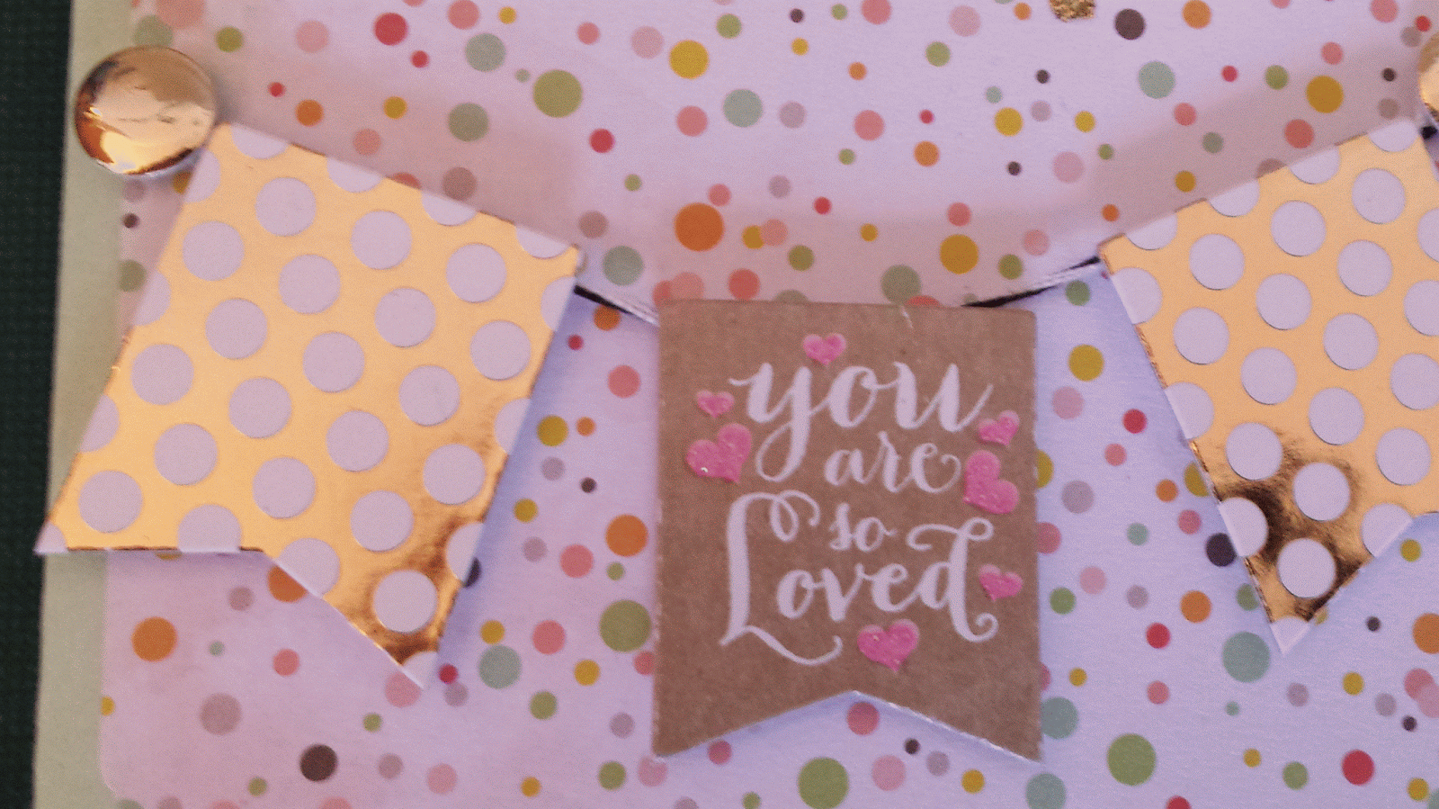
  • 3 flowers
  • 3 colors (blue, orange, yellow) 
  • 3 papers
  • 3 pearls and 3 gems 
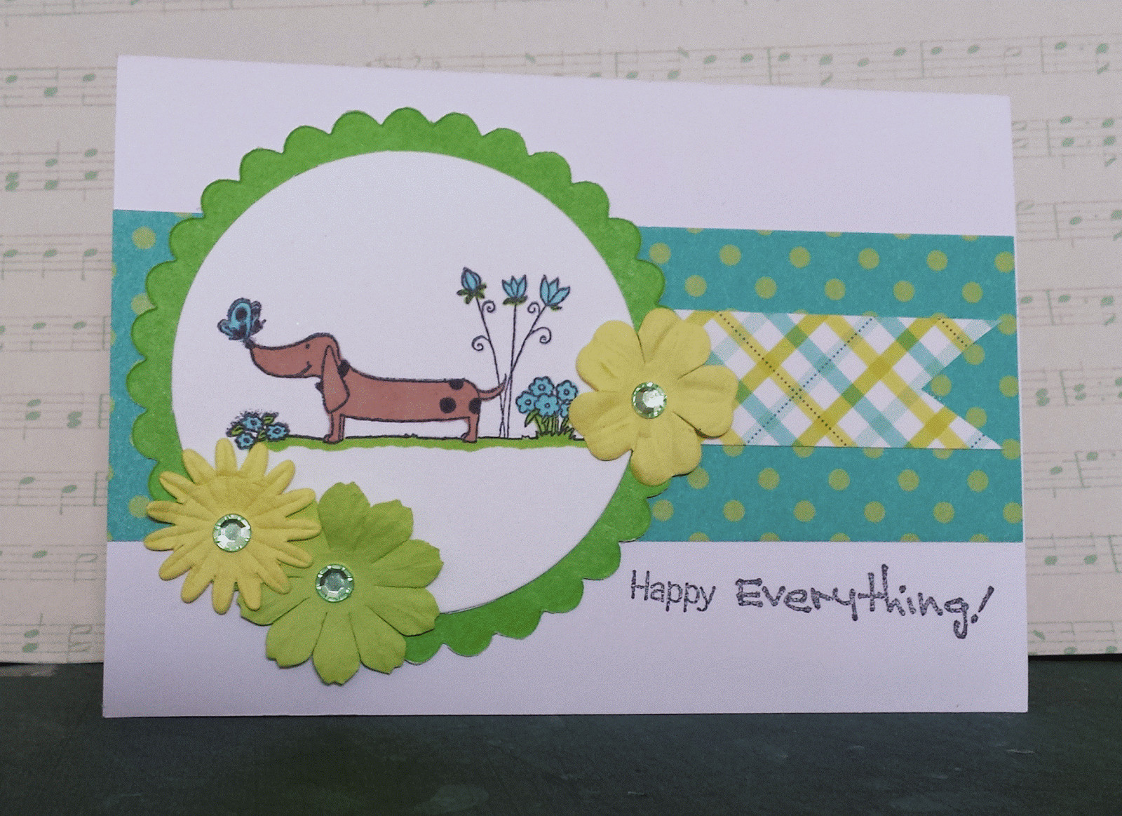
I started with the little Fiskars stamp (I think it's Fiskars anyway?) which I bought in a sale earlier this year and have never used. I colored the (admittedly small) image with:
  • Orange
  • True blue
  • Yellow
Earlier today I spied the sketch at Freshly Made Sketches and decided that was a good one to join as it's the sort of layout I like to go for - paper rich and lots of ways to interpret it.
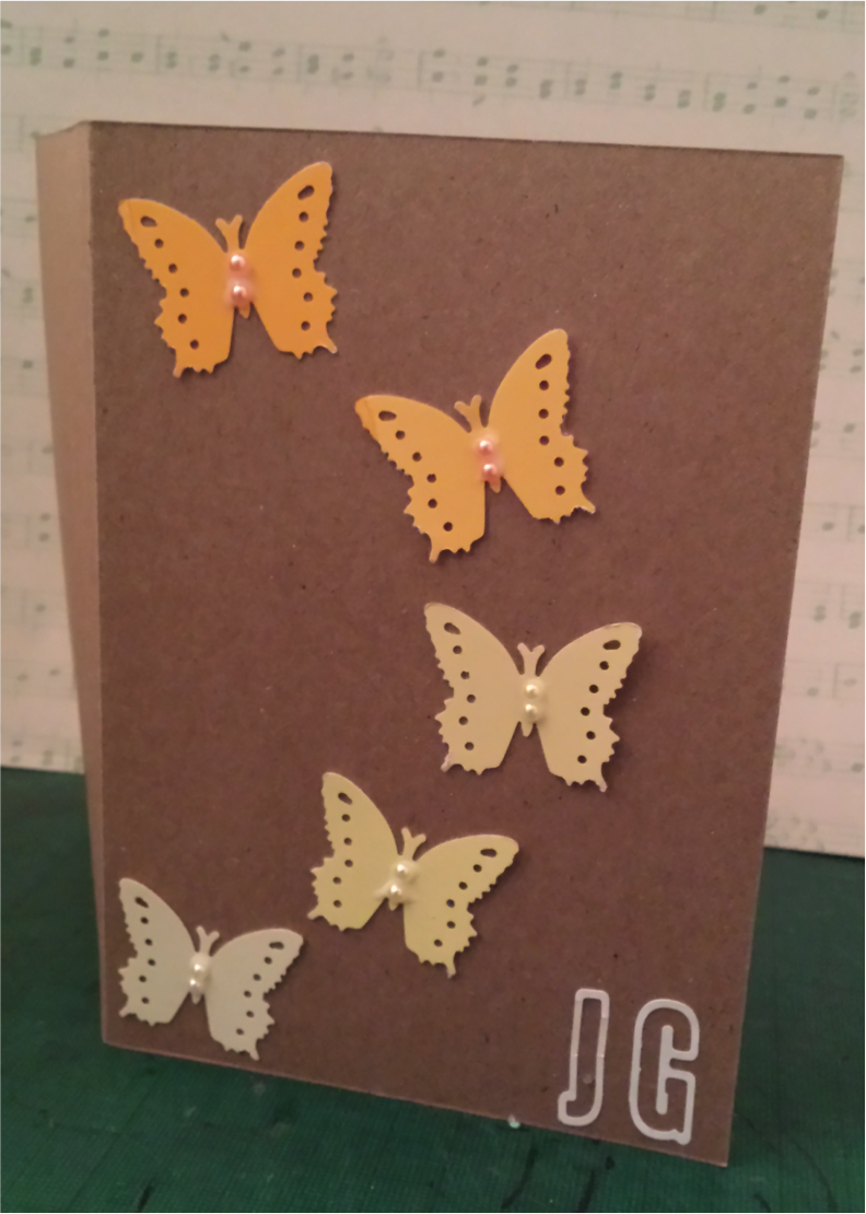
Instead of the circles I used the rectangle image and a punched butterfly - hope that's an ok interpretation of the sketch.

I then looked for complimentary papers and was delighted to find the blue chevron and corrugated orange in my scrap folder. Claire does scrap amnesty really well and I just love a clean sheet....which is why I need to get better about using scraps. Sketch challenges are great for using scraps as you think of paper in different ways.

And also great as I discovered Clear it Out Challenge which is is having a "use your orange stash" challenge - a clear out and a challenge entry - score!

Instead of the banner shape I cut along the chevron lines - just felt like a better way to use the paper.

Finally I topped it all with some bling and pearls and added the little "friends" greeting tucked in the corner under the paper.

And I thought I'd also include this in The Pink Elephant's Anything Goes challenge.
 
It's been a fun evening putting this together - the perfect anecdote to a stressful return to work. And I think

Thursday 23 October 2014

Project: Someone Special at Christmas for MAWTT


This week Shell is hosting us at Moving Along with the Times and we have a Somone Special at Christmas challenge. Please indicate that this card is for someone special on the card, either in the sentiment or greeting - and that's it!

For my take, I wanted to feature this fun Kenny K holiday image. The Kenny K team are having a Christmas twist this week so I'm entering their challenge as well. I colored her using ProMarkers and then die cut the circle so I could get the layered effect that I wanted.

The baking papers are from a christmas stack and a glitter card stack from Michael's. I have always loved the argyle print but struggled to use it - I think it works here with the other elements, if a bit busy.

I wanted to make this more like a package so I added the tag and double wrapped it with some chunky string- I had this vision in my head to get all of these layered stacked up and I'm really pleased with the outcome.

Final touches were to glitter the fur trim on the santa hat and add a sparkly candy to the corner.

Can't wait to see what special somone is getting your Christmas creations week!


Saturday 18 October 2014

Project 184: Monograms and paint strip punches


I need to make a set of cards for someone I am seeing next week and wanted something modern and fresh. I saw this post yesterday on Pinterest and I thought it was great inspiration. This is the pin I found:


I have this little butterfly punch and thought it would be great for the paint strip gradient. I looked at using a white or black card base but went for the craft card as well as it looked more striking with these colors, especially the fainter shades in the base.

The headline card shows the details - I punched 5 butterflies from the paint strips and then followed a similar arc around the page. I added tiny little pearls to match the colors just to give it a bit more dimension.

Instead of a greeting I opted for a white monogram for the recipient. These are Tim Holtz Alterations strip die and as I just got a brand new Big Shot machine I decided to get these out. They never worked properly on my Epic Six - in fact I almost binned them because I thought it was a bad die! They are a double letter punch, so I pulled out the inner bit as I liked the outline here.

Here's the full set in all of the colors:


It's a simple layout and yet it used a fair amount of kit and manages to look CAS and modern. Hopefully the recipient will like them as well!

Monday 13 October 2014

Project 183: A little cute bicycle set


My mother-in-law asked me to make cards for all of her sisters (she has 3!) for their birthdays this year and it's been a fun little challenge to make them throughout the year.

The headline card is an example from a set I just finished. These are really playful and fun, for one of her sisters who used to be a cycle enthusiast.

I used a Sizzix stamp and die set that I got ages ago (copying Claire as she had it- something I am often guilty of!) and decided to dig out for this set. It's so simple but it really does look modern and fresh.

I kept it girly using a patterned paper scallop-diecut from the Family Ties paper pack and a plain colored card as a background for the bike. I added some layered flowers to tie into the colors in the papers and then instead of going onto a bigger card I kept these on smaller 4x4 inch squares so they really a feature.

I added a bit of glitter glue to the wheels to add some extra sparkle and stopped there - it's a lot better to give blank cards (or monogrammed) so the recipient can do what they want with it.

I think the pink may be my favorite - it's unabashedly girly and I like it!


Thursday 9 October 2014

Project: Dog-gone-it challenge at MAWTT


Susan is hosting our challenge at MAWTT this week and we have a "Doggone it!" animal theme. I had a hard time deciding which dog stamp to use as I have so many!

I went for this little daschund dinky stamp from Little Claire as he makes me smile.

I colored him with ProMarkers and then die cut the circle shape and green scallop shape. The spotted paper is from Tiger (a kid's craft pack that I loved) and the little banner is a Martha Stewart punch-pad scrap. I have been trying do some scrap amnesty and use scraps instead of new sheets - the green scallop was from the same exercise!

The flowers are from a Recollections pack and they are topped with green bling. Finally the greeting is also from Little Claire as it goes with the cheerful colors and image.

I can't wait to visit your furry friend choices this week!

Monday 6 October 2014

Project 182: A huge hero birthday


It's my friend Harry's birthday today and I forgot to bring him a card today! Gutted!

So to make it up to him I made a card using Huge Hero from Kenny K. If you don't already know I'm obsessed with Kenny K then you can get into the craze yourself as this stamp is currently on sale - it was all I could do not to buy everything in the sale myself!

The image is colored with ProMarkers and then I cut it out. I love this brick-embossed white photo paper which Claire gave me and I think it looks great with this image. The star paper is from a Dovecrafts monotone pack I picked up a while ago.

The greeting is an inside joke - my friend is a copywriter and I'm always asking him for little favours like blog writing for client blogs I manage and so I thought I'd make a joke. And yes - I decided to use my awful handwriting instead of proper writing or stamps or a printed message - more personal that way.

I'm entering it into the KennyK blog Anything Goes challenge as well. Hopefully he'll like it and it'll make up for my tardiness on forgetting it today!


Wednesday 1 October 2014

Project 181: Sexing up black and orange


As it's the first of October, there's a trend to get all jazzed about Halloween amongst us crafters and I decided to dive head first in with a sexy take on the spooky holiday. No pumpkins here, just a bit of fun from Kenny K!

Their black and orange challenge 181 (I'm hoping I'm lucky as that's the number of this post as well!) was perfect for Veronica Vamp, a stamp I bought just this week.

The colors are a perfect match for this week's Color Throwdown Challenge:


I colored the image using ProMarkers and die cut her out in the petal shape with an inked edge to add a bit of darkness to the bright white paper. I layered that over a black paper doiley, which went over a textured black and white houndstooth card stock.

The orange chevron ribbon is actually fabric ribbon but it worked so well here. I added some black and white thread and a black and white stitched bow - once I start using ribbon I can't stop! The brown flag has a hand-written sentiment - I struggled to know what to put there so I just came up with something!

I thought I would also enter it into The Pink Elephant's Anything Goes Challenge this week.

Happy first day of a Halloween-themed month to everyone!

Saturday 27 September 2014

Project 180: A CAS double challenge


This has been a hectic week and so I was desperate to spend some time in the craft room to unwind.

I was feeling too drained to do any colouring so I was looking for a project that had a few elements I could piece together without needing a big coloured image.

When I saw the layout at Freshly Made Sketches this week I knew it was going to be what I needed:

 
I also took inspiration from Color Throwdown


I used a Kaiser Craft stamp down the left hand side to create the pattern in brown ink directly on the craft card. I used the same dark brown ink to add an edge around the tag and stamp the hello greeting. 

The heart and mustache combo are from Recollections at Michaels. The green and white ribbon is so fun, I have been saving it for ages and decided to use it for the green accent. I got it ages ago from a sale at my local sewing store and what I was saving it for is beyond me! The sequins and bling give it that scattered and random feeling. 

Pretty CAS this week but I think that keeps it pretty modern. Feeling much more relaxed now that I've had a chance to craft!


Thursday 25 September 2014

Project: Debut MAWTT DT 3-2-1 Challenge


I am super excited to be leading my first challenge at Moving Along with the Times this week!

I love challenges that give a bit of interpretation so I decided to set a simple recipe: 
  1. Image
  2. Papers
  3. Colors 
I love Little Claire stamps so I wanted to use one for this challenge. The hot air balloons are a set of three and I thought they worked well in the cheerful orange, yellow and burgandy colours, all colored with ProMarkers.

The yellow paper is oragami paper from Tiger and the orange corrugated card is so old I couldn't tell you where I got it.

I wanted to add a few embellishments and so I looked for a heart that matched the same yellow. I added the orange chevron ribbon under the orange paper and touches of glitter to the balloons.

I can't wait to see what you all do with the recipe.

I hope you enjoy the challenge, I can't wait to see what you do!

Thursday 11 September 2014

Project 179b: An alternative woodland creature card


I just posted about my friend who asked me to create some lovely little woodland creature cards a while back.

Feeling the woodland theme a bit further, I got this great little set of woodland digis and this little skunk holding a flower caught my eye. She's so sweet and when I saw that Digi Chooseday were having a monochromatic theme I decided to have a bit of fun and make her green. Why not?!

There was something attractive in making them green rather than traditional black and white.

I colored her with a series of green ProMarkers and then die cut her using a scallop circle die, followed by a green scallop for baking. I added a strip of green gingham to make it a bit more cutesy and added a punched and pressed paper flower with a green bling for detail. It was a bit busy for a stamped greeting so I added a foam-padded greeting instead.

And after a bit of glitter and a candy I left her be. Some things need to be simpler rather than more complicated!


Project 179a: A foxy girl double challenge


My friend a while back commissioned some woodland creature cards and asked me to consider a few more options for different people.

So I decided to have a look at a few things for her starting with my lovely Gorjuss foxy girl stamp from Claire. She's such a sweet image. I saw the colors in the Color Throwdown and knew they would work brilliantly with her.


Needing a bit more inspiration I used the sketch from Freshly Made Sketches this week to give a layout:

I used ProMarkers to color her in and decided to go a bit punk with blue hair. Why not?! I backed her on green paper and punched out a starry border to go with the pattern on the dress.

I added the stitched blue ribbon instead of a paper border and added a knot where the sketch from Freshly Made Sketches has an embellishment.

It's a bit hard to see (pardon the light - it's late here in London as I write this!) but the backing paper is a lovely fine-lined grey chevron paper to go with the grey in the scheme. Just a little extra touch.

I hope my friend likes it as much as I do!


Project: Grey, black and red texture card for MAWTT


This week we have a texture challenge at Moving Along with the Times. This can be interpreted in a lot of different ways - embossing, fabric, layers of embellishments - lots of options! 

I used an embossed card from Claire, featuring a funky collage style pattern. I layered this with a grey star paper and divided the two with a black and grey ribbon. 

I added extra texture by using silver glitter over some of the embossed features and added some bling and sequins for a bit of shine. 

The label is die cut and layered with another diecut greeting from my stash. 

It's a bit more masculine than I intended but all the same I love how it has turned out. 

Looking forward to seeing how you interpret the texture brief! 

Monday 8 September 2014

Project 178: A London travel card


A friend at work asked if I could make her a London card for a friend who was traveling to visit. She saw the one I made a few weeks ago and asked for the same stamp but with the request to make it "more British, more festive!"

I saw that Digi Chooseday Challenge had a travel theme this week and I thought that would be a great entry for their holiday challenge as my friend is giving it to her friend visiting London for the first time.

The image is a Penny Black stamp that has been scanned and printed - a DIY digi! Makes it more consistent and easier to work with when doing orders like this! I colored it using ProMarkers and backed it on red paper.

The blue background is embossed with a Union Jack - fulfilling my "more British" requirement. And I cut out some Union Jack bunting from an old Jubilee paper stack to fulfill the "more festive" brief.

She wanted it greeting-free so I called it a day - very pleased indeed. Now for a spot of tea to call it a British-inspired day.


Sunday 7 September 2014

Project 177: A double sketch challenge


I love a Skype playdate - don't you? :)

Today Claire and I had a little adventure with Freshly Made Sketches as our inspiration. Here was this week's challenge:

We did a few takes on it but I like the headline card the best.

I started with a stamp from a craft magazine years ago - I think I bought the mag just to get that stamp - and die cut it out using a scallop circle. I slightly inked the edges in black to give it a bit more depth against the patterned paper.

Next a I used a KnockOuts lined scallop punch for the border. I added a metal Thank You I've been saving up for the right card - I think it really works here with the papers and image. Finaly I added a candi for balance. Not too complicated but really nice impact I think.

 I thought I'd show you another take I had on the sketch:

 This uses a fun 3D layered die and banner set that is totally hipster. I used a pink paper from the Neopolitan stack from Recollections and a strip of brown and white gingham that is from my scrap stash. It's such a busy image I left it that simple!