Sunday, 29 March 2015

Project 213: A very cheerful challenge entry


This week I spent some money on Bugaboo's retired digi sale. With some stamps available for less than $0.50 it was just too irresistable!

This mouse image is my favourite of the lot. Look at its little face! I knew he'd look great cut out in a circle and when I saw the sketch at Sketch Saturday this week I knew it'd be a perfect one for this little guy to be featured.  Here is their sketch for the week:


I am coming off the high of winning a Cut Above shout out at Paper Players (see my shiny new badge?!) and so I was very happy to see their bingo card challenge this week. I am going for the diagonal row of:
  • Any shade of yellow
  • Sequins
  • Polka dots 

I liked the color combos at this week's Color Throwdown Challenge and thought they would dovetail with the Paper Players board as well.


Finally all of the layers added to the page made me think of Digi Choosday's challenge to get layers on there. I know it may not be a lot of layers for some but for someone who defaults to CAS layouts this is loads!

This card really created itself - once I had die cut the mouse image out and colored him in with ProMarkers I found the spotted paper for the background. How perfectly does that match the color combo? I embossed the yellow card with small dots for extra texture and cuteness. The celebrate stamp is an old favorite - maybe Studio G but not sure - and I think it adds so much to the festive feeling of the card. I went for big and small sequins to complete the bingo card and really think they add the right amount of bling with the tiny red glittery heart on the mouse.

So chuffed with this card, I can't help but smile when I see it because of all the fun I had making it. 4 challenges is a lot for me to enter in a single card but I love how it all came together here.


Thursday, 26 March 2015

Project 212: A triple challenge Easter card


I saw the layout at Paper Players this week and knew it would be perfect for the new Bugaboo Easter stamp I bought in the sale this week. Claire alerted me to the sale and - if you haven't checked it out yet - get over to Bugaboo and get involved!

Anyway - back to the challenges - I wanted to get involved with The Pink Elephant and I <3 ProMarkers challenges with Easter themes as well as I've been off the challenge circuit for a while.

The background is embossed with a basketweave pattern and the stamp is layered up in a lovely spring green color to offset the orange. The image is colored with ProMarkers (always!) and I added the O Happy Day greeting to add an appropriate sentiment.

The big heart is a Woodware punch and the little hearts are punched out of card stock using a small punch from Tiger. Finally I added a green gingham candi to top it off.

It's fun to be doing a few challenges again, hopefully I'll find the time to sustain it!

Project: A Wild Moving Along with the Times challenge

This week at Moving Along with the Times we have an "Into the Wild" theme for you - country, weather, animal or whatever this means to you.

I decided to use one of my favorite but often under-used stamps from Little Claire, a beautiful elephant stamp with a reflection pool of the image. It's a bit tricky to use but it's just so stunning.  I put it on a slightly textured mustard card stock so that it would have that grainy appearance - it's quite a big image and I love the way it looks with a bit of color coming through it.

The punch is a Martha Stewart branch punch that I used as a border. I decided to use natural card for the greeting and embellishments. I thought the gold gems would look like petals or leaves - not sure they do but they're sweet all the same!

Originally I had it all over a patterned paper but I thoguht it was too busy so I paired it back and just used white. I'm glad I did, I didn't want to ovewhelm the beauty of the image.

I can't wait to see what you do with the wild theme!


Tuesday, 24 March 2015

Project 211: My new favourite kid's card


A colleague gave me the best brief for a card the other day:

  • Girl turning 3 likes:
    • Princesses
    • Pingu
    • Shaun the sheep
    • Lego
Usually I try to pull  out one main thing as the card but with this one I thought - let's see if we can get all of those in there!

I am really pleased with the result. I used a Little Claire stamp for the feature, colored with ProMarkers and layered with nesting Sizzix label dies. I added a touch of glitter glue to the butterflies for extra sparkle. 


Shaun and Pingu are both cut out of layered paper - the black and white are both scraps I had on my desk already so that was a win. The eyes are the off-cut of a punch I have. I sent these to my colleague to 'approve' before I stuck them all down and she was over the moon with the detail. Honestly they weren't too bad - I didn't even need a scalpel, I just used scissors. 

The dots on the Lego blocks feature the same dots. I used extra thick glue to stick them down so that they'd have that 3D effect. 

I decided all of the items along the bottom should be raised on foam rather than stuck down fully. Kids cards always have texture and layers and I thought I'd give them a bit more standout that way. 

Finally I topped them off with some sparkly letters that were freshly arrived from Claire. I think they are just perfect for the project to finish it all off. 

My colleague is thrilled and so am I - hopefully I will get a few more briefs like this as they are just so much fun! 


Saturday, 14 March 2015

Project 210: Some additional custom Mother's Day cards


I was asked to make two more custom Mother's Day cards ahead of this weekend's UK holiday and I wanted to showcase them here.

They were super different so bear with me while I explain the briefs!

The headline was a request from a girl who asked for a Ukranian themed card. Yes. Ukranian. The flowers were modeled on Barvinok flowers which are a national symbol for them. I happened to have these already punched and molded into their 3D shape so that was a fantastic stroke of luck that they were the right color. I decided to use them against the yellow embossed paper which is a tricky folder to use. I decided that since it was already a pretty random card I'd go further and glue some gems and tie a bow on it - why not?! The little gems are Anita's and I think they add a delicate little detail to each flower.


This second card is much more CAS and more my style. A colleague saw a different card in my stash at work with these Inkadoo fossil leaf stamps and asked if I could make something very neutral and natural looking for his mum. I decided to do double craft card to get a good natural base. The stamps are using brown and green inks for a really subtle impression. It was looking too plain so I added the green backing paper and wrapped some twine around it with a button. Much more interesting.

I actually tried to do some heat embossing on one of them but that was a fail - I've only just started doing that and seem to have a 30/70 success rate of it. More practice needed!

I hope the cards meet the briefs with my colleagues, I'm pleased with the variety and opportunity to try new things. Hopefully their mums will like them as well.


Thursday, 12 March 2015

Project: 3 in a row challenge at MAWTT


This week Sue has brought us a bit of fun for us over at Moving Along with the Times: pick a line in the board to make 3 in a row and tell us what one you're using:


For me it's the diagonal of Die, Image and Gems. 

I got this amazing stamp set from a magazine and thougth it would be perfect for a colleague's birthday card as it's, ahem, a significant one! 

The image is colored with ProMarkers and then diecut using nesting XCut label dies. The sentiment is from the same stamp set and I just love how it fits beneath the car perfectly. 

The background paper is from Tiger and I used some of the graphic stamps from the set to add that retro pattern around where the dies sit.

I added the blingy 40 (I mentioned it was a big one!) and then I added the little blingy headlight gems to make it look like a chrome finish. 

I can't wait to see what you go for, I thought it was a great challenge!

Wednesday, 11 March 2015

Project 209: The Owl and the Pussy Cat


I love a bespoke brief. And that's what I got from my colleague and good friend Jude when she asked for a card for a friend of her son's with an Owl and the Pussycat poem. How sweet is that?

As it turns out - Claire has just given me an Owl and Pussycat stamp. Serendipity strikes.An opportunity to use something new is always a win. I colored in the image, cut it out and layered it behind some paper waves. I punched some stars in green and blue for texture and dotted them around the page.

You can tell I was in a hurry to post this as I didn't wait for the glue to dry clear!

I thought I'd enter it in the I love ProMarkers challenge for their fantasy theme as I only ever use ProMarkers for my coloring and thought the fairy tale poem was perfect for the challenge.

Only update: I subsequently re-read the poem and colored the boat green. I don't like it as much as I had to color over the brown but hey - gotta be true to the poem for a 5 year old as they will totally spot it!


Monday, 9 March 2015

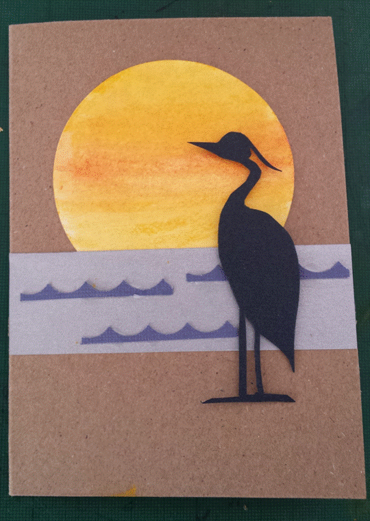
Project 208: A heron Mother's day card


I got a wonderful commission from a colleague to make her mother a card with a heron for UK Mother's Day. She said her mom was really spiritual and that it was a symbolic animal that she liked to include wherever she could.

I accepted the commission knowing I didn't have a stamp or anything that could work out of the box and went to my favorite (and underused) technique of paper cutting. It's been ages since I've done it properly and even though this was a small scale I embraced it.

I looked up images of herons and drew a silhouette on black card stock, using my Fiskars finger blade to cut it out.

The sun is a diecut circle that I used Gelatos and a watercolor pen to get that beautiful streaky result.

The silver water is a scrap I had on my desk as are the blue waves - in fact everything but the sun is a scrap as the black was leftover as well from another project - and the waves were the off cut of a scallop punch. I saw that recently on a YouTube tutorial and had my mind blown. So simple. So effective.

I asked my colleague if she wanted a greeting or sentiment but she liked the simplicity of it and I agreed - so nice it's like a mini art piece.

Very happy with this result, hoping to have a happy colleague as well!

Sunday, 8 March 2015

Project 207: An alternative Mother's Day card


I saw this pin on Pinterest the other day and thought that it would be perfect for a little Mother's Day card. Following from last week's version I wanted to try something a bit different to sell in the office and I think this quirky, CAS design will be a hit with my colleagues.

I made 3 boy versions and 2 girl versions using different paper scraps I had lying around and used natural card stock for all of them to make them more natural. I chose buttons with 2 holes to mimic eyes and decided to draw on the arms and legs with a felt tip pen. Instead of roses I used little paper flowers I had and flower gems as I wanted a 2D bouquet.

Hopefully they'll sell but I'm leaving them greeting free just in case - if someone wants it then I'll add a Happy Mother's Day greeting but for now they're blank so I can use them myself as thank you or birthday cards if they don't get sold!

Sunday, 1 March 2015

Project 206: Embossed floral Mother's Day cards

I managed to sell a few Valentine's Day cards at work so I thought I'd make a stash of Mother's Day cards to have on hand and see if I can shift them at the office.

I want to try a few different designs so I looked on Pinterest for inspiration. This pin below really looked sweet (and easy) to reproduce a few times in different colors:


 I then started looking for a good embossing fodler to use for the treatment and I remembered that Claire had given me  some embossed sheets with folders she has. I really liked these big hearts and thought they would be great for Mother's day.

For each one I trimmed down the sheet and layered it over a colored piece of stock. The red and blue headline card is my favorite, it's such a fresh take on the colors. I didn't add the greeting - I had this little idea that I'll take them to work and see if people want a sentiment and add it for them then. If they don't sell I can add a thank you or birthday and reuse them in the future!

The flowers were a bit different for each color combo,with  some foam, some felt, some paper - I just used what I had in each color and then added bling, pearls and gems for the centers. Here are two alternative takes:

 With blue and green flowers 

 With purple and grey flowers and a purple embossed card 

 I am going to try a few more Mother's Day designs but this was a really quick session and I hope they'll be a hit in the office!